6 – PROCESSING IN LIGHTROOM
Processing a Raw image in the Develop Module
Now the fun starts, processing the image in LR. We will do all the basic editing, getting the image ready to send to PS to complete. In this section we will learn:
How to use the each of the Panels.
How to understand the Histogram.
How to use Transform for corrections.
How to use masks.
Let’s see how to get from the two Raw images to the finished image below. I chose this image because there are some basic editing steps and a few more advance techniques in Photoshop used, including selective colour, adding a sun glow, blending images and creating depth.

River Brathay, Lake District
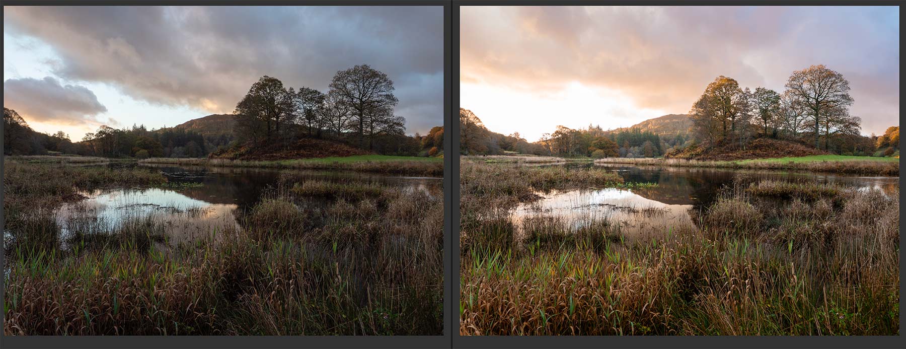
Two Raw images with basic processing I will use for the final image.
The final image was created from the two raw images above (both available for download on the Introduction Page). Both have had some basic processing applied to check which I prefer. The main image on the right is fine, there is plenty of colour and some wonderful highlights of light hitting the trees, the foreground and the hills. The sky is blown which is not a problem because I took another which was darker to protect the highlights so I can combine them. The first image above was taken a few minutes before, I prefer the clouds, it is more dynamic with a line leading onto the scene, so I can use this to merge into the shot. But I have to be careful because I also have to blend the water, otherwise the reflections of clouds will not match. Look how different the water is. You cannot blend a sky if there is a reflection which does not match.
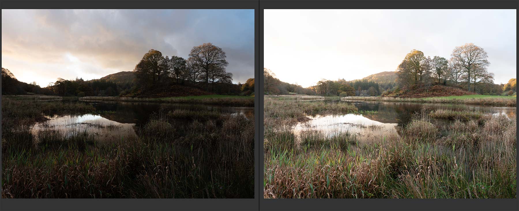
11mm-1/20th @ f6.3 ISO200 11mm-1/5th @ f6.3 ISO200
Above are two raw files for the second image. The highlights in the sky are fine in the first frame which was under exposed by 2 stops. The second frame is brighter and was correctly exposed. I can process both of these and combine them in PS, or I can use LR HDR.
LR HDR MERGING
The easiest way to merge two images with different exposures is with HDR Merge. It is very simple and often produces very good results, however sometimes the results are not so great. Learning how to merge together in PS give far more control and is not difficult, but it is worth checking in LR.
Select the images to merge, colour rate them and filter or use Cmd/Click. Right Click and select >Photo Merge> HDR.
Select Auto Align and Auto Settings. Deghost will try to remove motion blur if any is detected. The image will then come back to LR as a new DNG Raw file allowing you to process further. In this the blown sky has been merged quite successfully.
I prefer to disable Auto Settings once I have checked it and just use it as a preview, it is the same as selecting Auto on a Raw file. Once it is imported into LR as a new DNG file (which is a raw file) I can select Auto again and I will then have a history state I can undo if needed.
I am not going to use the HDR image because I want more control and I will exposure blend two images together in PS. We will revisit HDR in another section.
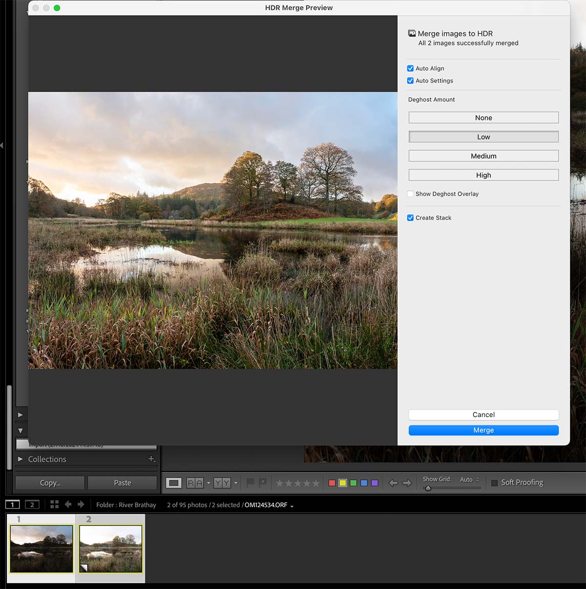
LR HDR Merging Dialogue
BASIC PROCESSING
From the two Raw files shown above I need to decide should I use the under-exposed image or the correctly exposed image? I can try both to start off with by just clicking ‘Auto’ in the Basic panel and then inspecting them. Generally, an image where you are reducing bright tones will give a better and cleaner image than an image where you are opening shadows and making brighter, there will be more noise. However, LR Denoise is now fantastic and does a very good job, but it is still good practice to start with the best image.
I will use the correctly exposed image because I have already decided I want to blend part of the sky anyway, so I need not be concerned that the sky is blown. The Histogram confirms this, however I had the foresight to exposure bracket in such challenging light.
The Basic Panel is where you make adjustments to try and balance all the tones and colour. It is a balancing act of all the sliders.
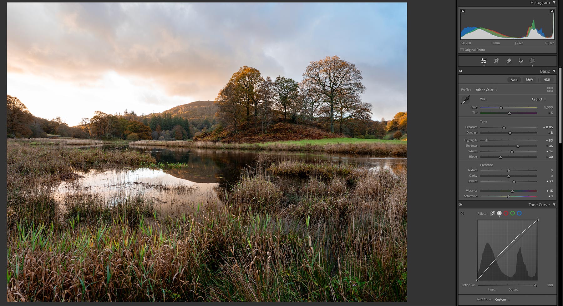
Basic Panel
Start by clicking Auto and see what the result is. It can be undone in the History Panel. We will fine tune it as needed. Auto often works very well and you can learn from it, however it is better to make adjustments yourself. You can see my adjustments in the Basic Panel here.
Select the Profile you want. I just use Adobe Colour; Adobe Landscape is often very good but can be over saturated.
My normal first steps will be reducing Highlights, increasing Shadows, increasing Whites for more brightness before Exposure. This gives a better balance before I start making more adjustments in the Basic Panel.
Before adjusting Exposure, set the Black Point and White Point. Hold down Shift and double click Whites and Blacks. LR will auto adjust the maximum black and white to the ideal setting. I increased White a little more and reduced Exposure because I want the image to be brighter but not the overall exposure. Hold Alt and click the slider to see an overlay allowing you to adjust it just to the point where black or white is starting to show.
Next adjust Highlights to recover brights, and Shadows to open dark areas, I have only increased it a little. Increase Contrast and Exposure a little if needed.
Adjust White Balance. There are numerous ways, select the drop down next to ‘As Shot’, use the sliders, or select the Eye Dropper. Click around the image and watch the Navigator window at the Top Left until you see a WB you are happy with. We will adjust colour more later.
Adjust ‘Presence’. I have added a little Dehaze to boost tones and increased vibrance. I very rarely use Texture or Clarity and will use it with a mask if needed for more localised edits. It can be too harsh, so use gently. Use Dehaze very carefully too, it can oversaturate colour.
Adjust Tone Curve. Tone Curve is the same as ‘Curves’ in PS, usually an S shape is desired. Here I dragged it up a little to boost the brightness. See below.
TONE CURVE
The Tone Curve is a very powerful tool and allows you to adjust the tones and the colour as you can see. But why, when we have the same in the Basics Panel? The Basic Panel will adjust the amount of tone or light globally, whilst the Tone Curve allows more precise adjustment in a specific area, hence why a histogram is shown in the background, and they work independently of each other for finer control.
For instance I can reduce highlights in Basic panel which will reduce highlights across the whole image. I can then use Tone Curve to reduce highlights just in the bright areas. You absolutely should pay attention to this panel to get the best from your tones.
In the tones there are two modes, Parametric and Point curve.
Parametric Curve (shown) allows regions of tone to be manipulated by dragging on the line or altering the sliders. The area can be refined by dragging the sliders under the histogram, and specific areas can be selected by using the Target Picker (small circle icon) then clicking and dragging on the image. A ‘classic’ tone curve is an S shape (shown as example), but it is not always suitable.
Point Curve is a secondary mode added later by demand from power users. Points can be added (up to 16) and each manipulated as needed. Note there is also a colour slider; LR adjusts colour saturation based on your changes which may or may not be desired, adjust the slider accordingly to desaturate. In my image I reset the Parametric (right click inside the histogram) and used points to reduce highlights and boosted mids a fraction. Blacks were getting a little too black so I moved the black point up by a very small amount (shown as a white point).
Both panels work independently of each other and it can get confusing. Personally I would use one or the other only.
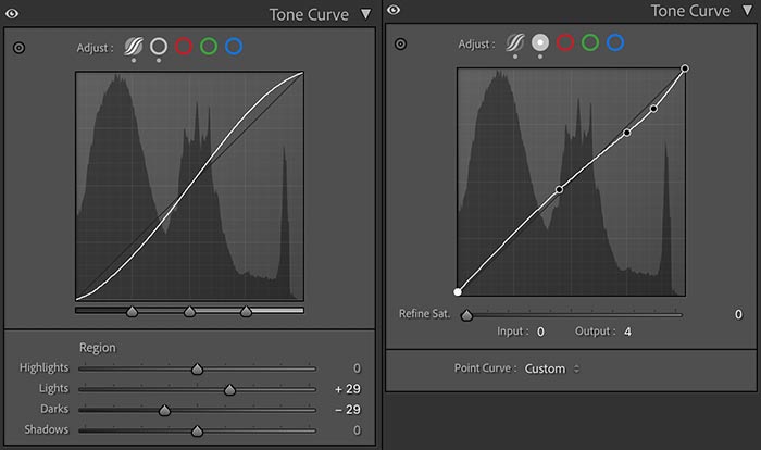
Tone Curve Panel Examples
We can also adjust colour with the red, green and blue channels. In each channel the colour can be manipulated in each tone range, dark, mid and brights for colour balance. It is useful when you have a colour shift or colour cast you just cannot remove. I find it most useful when there is a colour cast I cannot correct in white balance and just drag the line the opposite way to the colour cast I want to correct.
Here a blue colour cast is corrected by dragging the blue channel down into yellow until the colour is corrected.
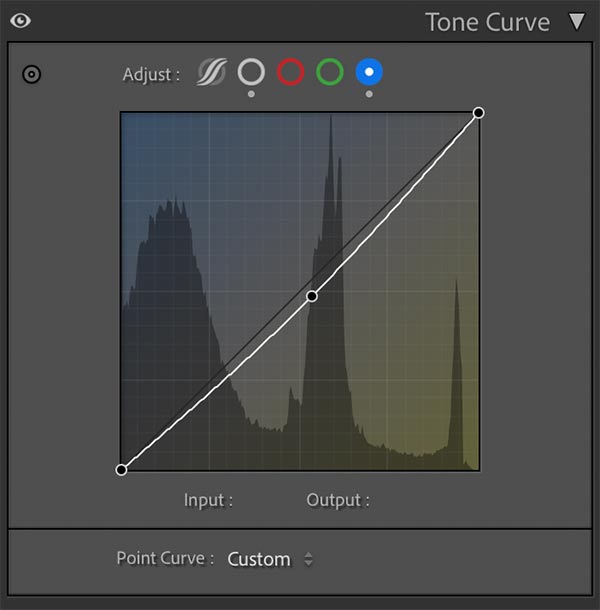
Colour Tone Curve
THE HISTOGRAM
We need to understand the Histogram in Lightroom which serves the same purpose as the histogram in your camera. The tones are shown in grey whilst the RGB channels are shown in their respective colours. Bright tones are shown on the right, mid tones in the centre and darks on the left. We can tell a great deal about the tonals values of an image without even seeing an image; if the tones are towards the left, its a dark image, towards the right a bright image. Normally we want a histogram extending all the way across indicating it has a full range of tones. If not it’s a good indication an image has been under or over-exposed. This doesn’t always apply though, a snowy scene will have more to the right and a twilight more to the left.
What we really want to avoid is ‘clipping’ when one of the tones goes off the graph. When this happens it means there are no tonal values and it is either solid black or white with no information to recover. The height indicates how many pixels there are in a given range and it is no concern if these go out of the top.
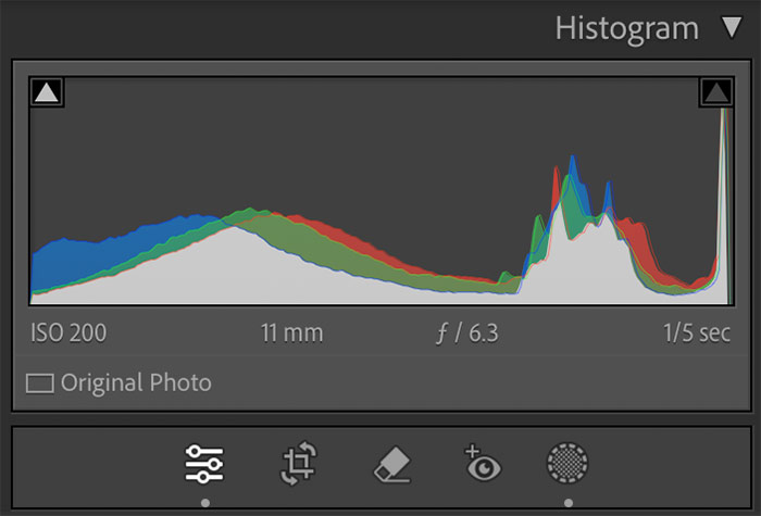
Histogram Panel
What can we tell here? After a couple of quick changes I can see the highlights are clipped. It doesn’t look like they are off the edge but they are and I can see the sky is blown. Luckily I exposure bracketed. They rise dramatically meaning there are a lot of pixels in that tonal range. The blacks are also clipped, but only just, there’s a sharp rise right at the beginning. The darks rise towards the mid tones meaning there is less black than mid tones which is fine. I can shift the blacks up when needed.
The mid tones are flat, there aren’t a great deal of them, as to be expected with what was quite a dark foreground. Again there is enough information for me to adjust. The histogram tones can be dragged directly for a quick edit although you are better to use the main tools.
A few neat tricks in LR:
- Click either of the triangular indications to see the issues with the highlights or darks, an overlay shows on the image to indicate each. Adjusting the sliders will move the histogram and affect the warning overlays.
- To auto set any of the sliders in Tones press/hold Shift and double click each one individually. This is a great way to set back point and white point.
- Press Alt while adjusting a slider and an overlay appears masking out the image to show the respective tone. For white we would adjust it until whites just start to show, and black the same. White can be manipulated too with Highlights, and blacks with Shadows.
ADJUSTING COLOUR
Next in the Colour section select ‘Adjust: HSL’. Hue, Saturation and Luminance can be selected individually or select ‘All’ to see all at once. Here I have little to change, I have shifted yellow towards orange more because it is Autumn, and increased Luminance of green because I want the green tips of the grass in the foreground to stand out. The grass in the background is now too bright but I will change it later in PS, though I could use a Brush Mask and reduce it now.
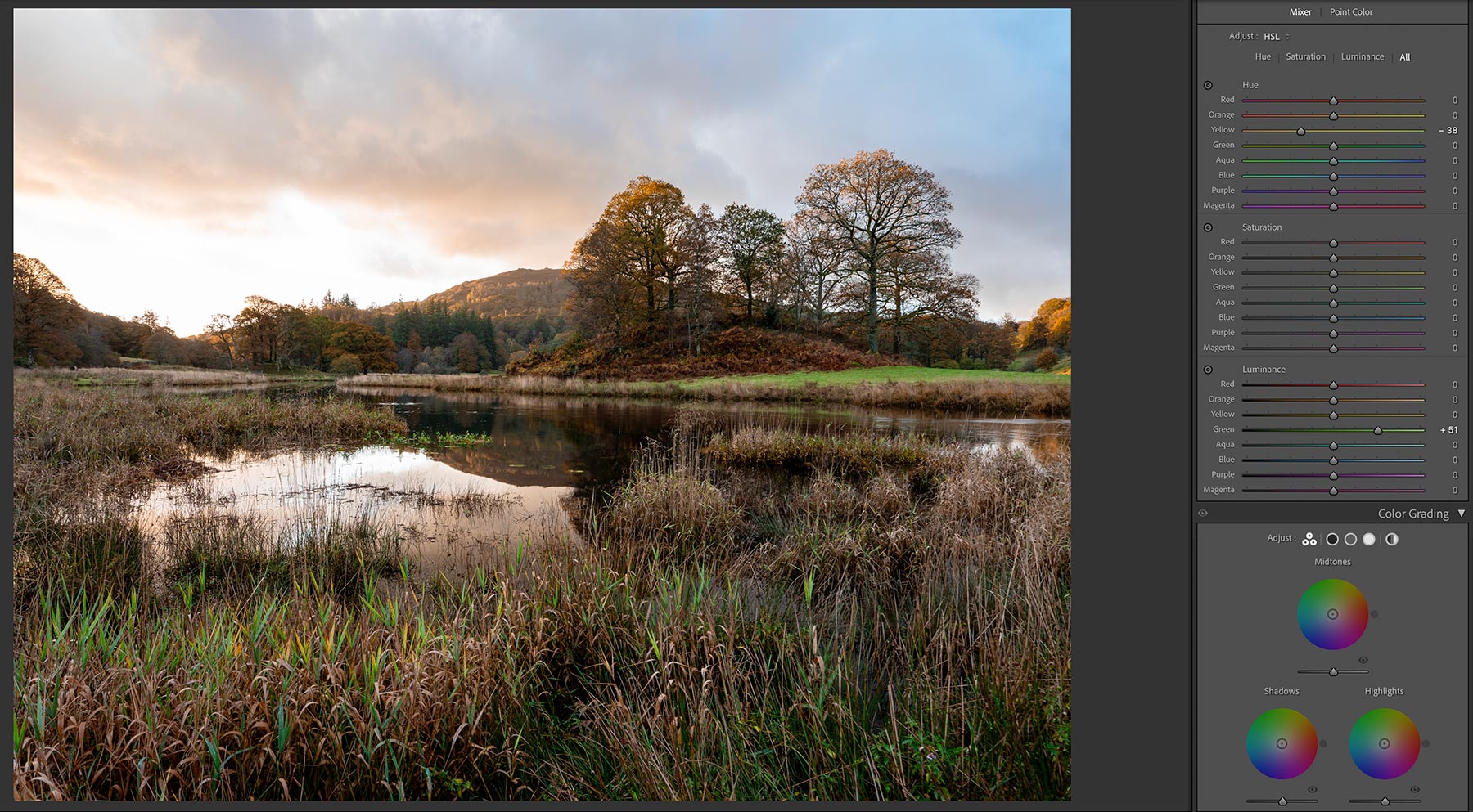
Adjusting colour with Colour Mixer
There is a lot of blue in the sky in the top right, which I could reduce, but I want to retain it. In the final image I like the contrast of the warm sky and the cool blue, suggesting the blue hour is giving way to dawn. I will keep an eye on it and adjust it later if needed.
Tip-Often when desaturating a colour, increasing the Luminance instead will reduce the amount of colour without reducing the brightness.
Colour Grading can be useful, note that it is separated into Midtones, Shadows and Highlights. By making subtle adjustments you can add some warmth to highlights and cool down shadows as they would be normally. Be careful to avoid a tint.
CALIBRATION
At the very bottom you’ll find a Calibration Panel. It always seems odd being at the bottom but Adobe must have a reason.
This is useful if you have a colour cast you cannot remove and you cannot quite find the right white balance. Adjust it if necessary to suit.
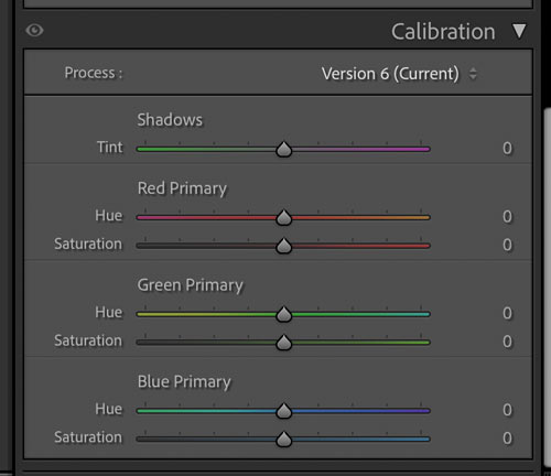
Calibration Panel
DETAIL SECTION & LENS CORRECTION
We can now add any sharpening, Denoise and check Lens Corrections. I leave sharpening at the default and rarely increase it, my lenses are sharp and I have no need to increase it. However there is a neat trick in LR that is worth exploring. Sharpening is obviously the amount that will be applied, whilst Radius (how far away from the centre pixel sharpening is applied) and Detail (the finer textures) are how aggressive the sharpening is applied to edges and detail. Press ALT while adjusting the slider and you’ll see an overlay showing you exactly what is affected. Neat!
Masking allows control over where sharpening is applied. With a high Masking level large areas of less detail will be masked out leaving just main edges being sharpened. Again pressing ALT will show a mask to indicate exactly where it is being applied. As I said most time the default is fine. I may fine tune if I have for example a long exposure with large areas of soft detail like water, and I need to sharpen the main subject a little more. Later we will see how we can improve detail clarity using a High Pass filter in PS.
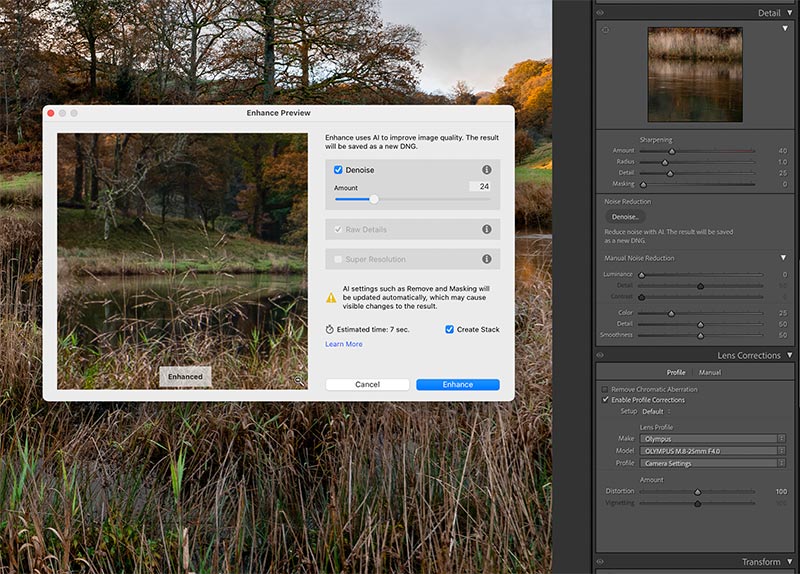
Detail Section and Noise Reduction
Noise Reduction was always LR’s weak point. Now we have the AI Noise Reduction and it is superb, it is in fact knocking on the door of DXO and giving them a run for their money. Run it and adjust just the amount needed and the image is then returned as a new DNG raw file. It can be used at any stage of processing and all edits are preserved including masks. There are two limitations; it can only be used on a native raw file, not Tiffs or Jpegs, and it cannot be combined with the Super resolution which uses AI to double the resolution.
A benefit of using AI Denoise is not only noise reduction with no loss of detail (used sparingly) it will also improve clarity, again another reason not to be aggressive with sharpening.
Lens Corrections – Modern Lenses will have lens corrections baked into them so in most cases there is no need to do anything. LR will read the information and apply it automatically removing distortions such as barrel distortion and Chromatic Aberration. If you use an older lens find it from the comprehensive list and apply it.
TRANSFORM
The last basic edit is correcting any uneven horizons and leaning verticals. There are a number of presets such as Auto, Level and Vertical, however Guided is often best.
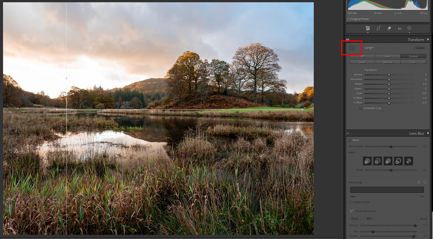
Correcting Horizons with Transform
Click Guided or the # hatch icon and drag a line across on the horizon or where you think the horizon should be. You can also enable the grid view to help. Then drag another vertically next to a vertical line, or in this case parallel to the edge of the frame. LR will straighten the horizon for you. It is a very powerful way to make corrections. I suspected it needed to be levelled a fraction and not having a true vertical to use I just made it parallel to the edge of the frame.
Interestingly 3 guides can be used to correct distortion too. Using 3 needs some care because the amount of correction can lead to the frame being over corrected; sometimes you just have to accept some distortion, or use a Tilt Shift lens.
MASKS
That is all of the basic edits complete which you will do quite quickly. Next are using Masks to make specific edits.
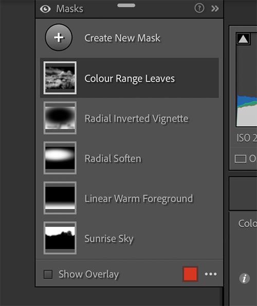
Masks Used
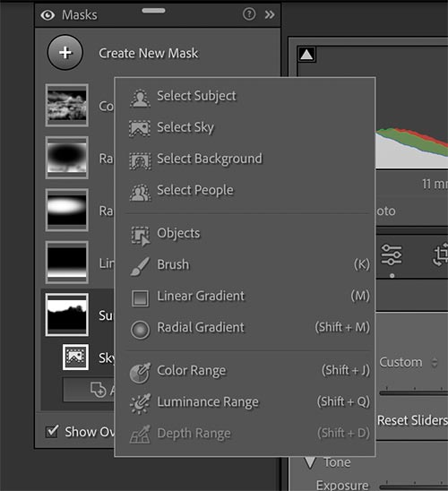
Mask Types
Masks are a very powerful and flexible way to make targeted adjustments to an image. In the first screenshot we see I used 5. To add a mask click the circular Mask icon at the top and select the mask type desired. They are powerful, however there is little adjustment to the mask created in LR possible, unlike the fine tuning possible in PS.
Another limitation is some items are not available to adjust within Masks. Hue and Saturation is replaced by Point Colour meaning you will have to sample each colour required to alter. Still, they are worth using when needed. Let’s look at each of the 5 masks I used individually.
SUNRISE SKY MASK
This is simply a ‘Select Sky’ mask, however new in LR 2024 are some Adaptive Sky masks which are simply presets with some adjustments made. The Show Overlay is selected simply to show how the mask has been applied in the screenshot.
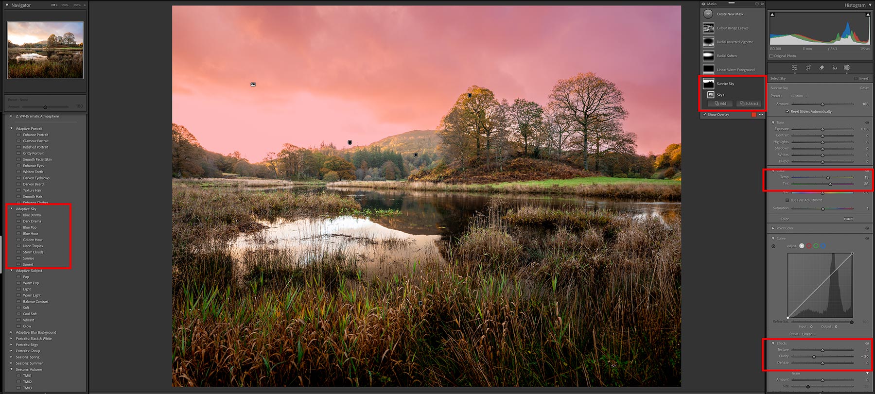
Adaptive Sky Mask
The mask finds the sky and tries to blend in anything crossing the horizon. Inevitably with such detailed objects as the trees and sky behind them it will be an issue and further refining will be needed especially if lowering the exposure. In this case all I wanted was to warm up the colours a little which it has done with Temp and Tint so the sky behind the trees isn’t an issue. Are Adaptive Skies worth using? It’s up to you, they are easy enough to do manually, clarity had been increased so I reduced it.
LINEAR GRAD MASK TO WARM FOREGROUND
A Linear Grad is dragged upwards used just to warm the foreground a little.
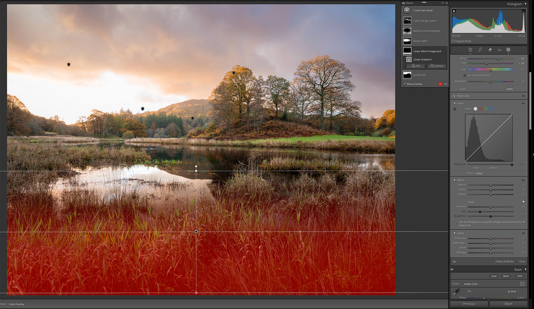
Linear Grad Mask
Temperature has been made warmer and Tint shifted towards green to prevent a Magenta a colour cast. This could easily be applied with a Brush Mask too. Note the control points which allow manipulation of position, graduation amount and angle too.
RADIAL GRAD MASK TO SOFTEN BACKGROUND
I often use Radial Grads, I do like how the Feather and Amount can be controlled. I find not trying to be too accurate is always best, until it is absolutely needed. Loose and subtle is always the way.
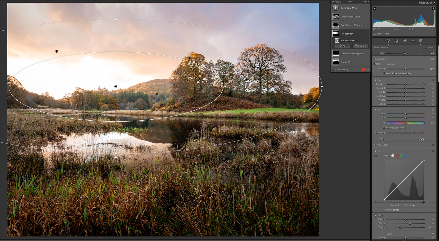
Radial Grad Mask
I used Negative Dehaze here to soften the background a little and increase the feeling of depth. Negative Dehaze is very useful, it has the effect of softening detail and also lightening areas by reducing contrast, but not making brighter like white or exposure would. Then to retail some detail the Clarity is increased a little.
RADIAL GRAD MASK TO ADD VIGNETTE
Vignettes are a funny thing, we do our best to eliminate them and then go and add them back again. I will often use a vignette, but they have to be subtle; they are useful for just pulling attention into an image but if it is obvious it has gone too far.
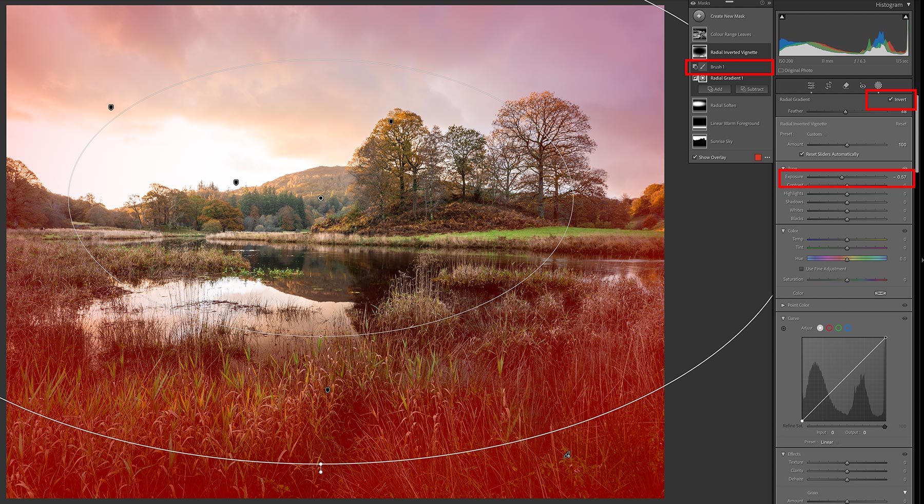
Radial Grad Mask
Using a Radial Mask gives more control over the size and position rather than just using one in the Lens Corrections. Drag a Radial Mask where you want it, adjust the shape, feather and Invert it and then reduce exposure to suit. Here it is only -0.57. Notice the brush icon highlighted; I also used Subtract with a brush and removed it from the lower corners a little.
COLOR RANGE MASK
Lastly I boosted colour a little using the Colour Range mask. Colour and Luminance range masks are incredibly handy allowing you to target specific colours or tones and then alter the range, or how much, is included in the mask before you change it.
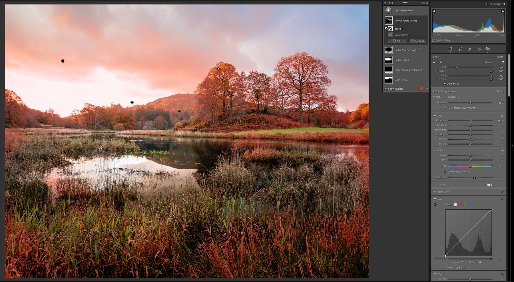
Colour Range Mask
Add a new mask and select Colour Range. Then use the Eye Dropper to select the desired colour in the image, in this case the orange, and change it as needed. I added saturation only and a little white to brighten them. Colour Range will select all the colour in the image which can be too much. To remove parts of the mask select subtract and use a brush to brush over the areas. Selecting specific colours can be easier in PS, however it worked fine here.
LUMINANCE RANGE MASK
Luminance Range Masks are important because they are a way to target the specific luminosity of areas in an image. They are a little crude compared to some plugins available for PS, but they are effective.
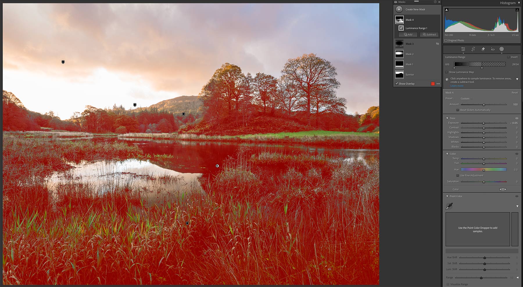
Luminance Range Mask
Add a new mask and select Luminosity Range. Then use the Eye Dropper to select the tones in the image, in this case the darks. Notice the slider that becomes available in the main panel, adjust the points to fine tune how much of the tone is included and enable Show Luminance Maps. Any number of these can be created for targeted editing.
Luminance Range Masks are very useful when editing tones, much more so than general sliders in the Basic Panel. Highlights for example, all the highlights will be adjusted with the Basic slider; a Luminance Mask can be added, the eyedropper used to target the tone and the Range panel then used to refine it. Although they are not as sophisticated as some luminosity mask plugins available for PS they are easier to understand and use.
PROCESSING COMPLETE
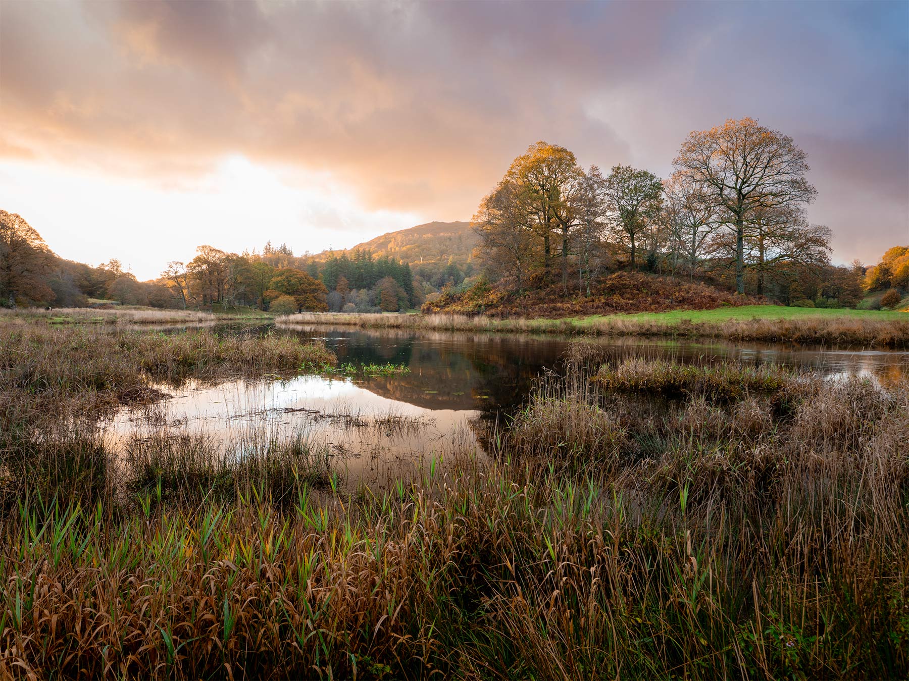
Completed Image in LR
The processing in LR is now complete. I am happy with the stage it is at, I could carry on and do more but the final steps I want to do are better done in PS. This may have seemed like a long process, in truth it took perhaps 15 minutes without rushing. Once you are familiar with LR, and understand what you want to do you will soon complete tasks quickly.
In PS I will blend in the part of the sky I chose to use from another image, and the water too. I will adjust colour more because it is more flexible in PS, soften the background a little more, and make some more checks to the tones.
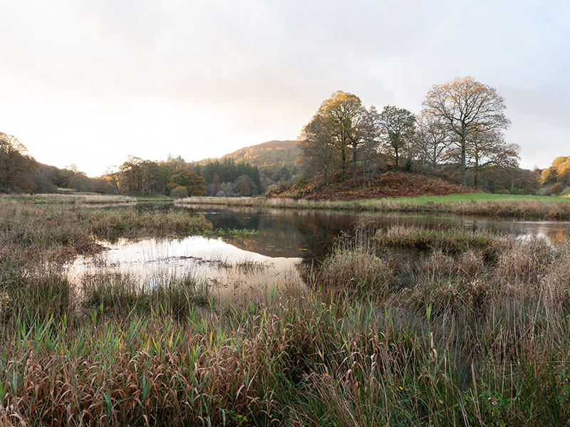
Original Raw Image
NEXT – 7 PROCESSING IN PHOTOSHOP
Final steps in Photoshop.
