
COMPOSITION
Exploring the art of Composition.
How to create impact in you images using using composition for harmony and retaining a viewers attention.
What is a good image and what does it consist of? Obviously good light, mood and composition. ‘Good’ light doesn’t mean it has to be bright and colourful, indeed the opposite can be true and this in turn creates the mood. A great landscape image with an interesting scene and wonderful mood created by the light can be completely ruined with poor composition.
Composition is a huge subject, there are so many ‘rules’ to follow. Though all my years of experience and teaching I have learned one thing, composition can be taught, but a good photographer has to have an ‘eye’ for it. That ‘eye’ for composition can be refined so that it comes naturally, it becomes more of a feeling with just a passing glance to so called rules, more a notion of what is harmonious and balanced and with an ability to read the landscape. Rules are there to be broken and it’s perfectly acceptable to do so, but the rules have to be understood first; breaking a rule by accident will show. The purpose of composition is to create harmony in your image and keep your viewer engaged. This quick rundown should lead-in the right direction (terrible pun intended).

For a bit of fun to start, take a look at this grid of images (actually my personal Facebook Banner) and consider where your eye is drawn to. Some have lead-in lines, others simply use a point-of-interest. Then come back to it and see if you understand my reasoning for the compositions.
‘RULES’ AS GUIDES
All the so called ‘Rules of Composition’ should be thought of as guides, there to assist in the process but not cast in stone. The Rule Of Thirds for example shouldn’t be taken literally, it doesn’t matter if a subject is not exactly on a third at all, in fact if it isn’t it will follow the Golden Ratio more.
Understand the guides to help you but don’t obsess over them; learning to feel the scene and read the landscape will come naturally after some practice. Your composition should be quite simple based on a clear path the viewers eye should take from one part of an image to another. There may be a main point of interest with a secondary point you want to guide the viewer towards, perhaps using a lead-in line, the golden ratio, or using positive and negative space. Perhaps there is only one point of interest, or three.
Decisions you make at the scene impacts how engaged a viewer is. Lead a viewer’s eye out of the image and the composition will fail. The ‘Rules’ are not mutually exclusive; in most instances you will find once you begin to understand composition it will start to fall into place. Using a main point of interest for example, balanced with a secondary point of interest, lead-in lines will naturally start to fall into place. We can break the rules down into 6 main areas:
GOLDEN RATIO
RULE OF THIRDS
LEAD-IN LINES
POSITIVE / NEGATIVE SPACE
POINTS OF INTEREST
VIEWPOINT COMPRESSION
COMPOSITION BASICS
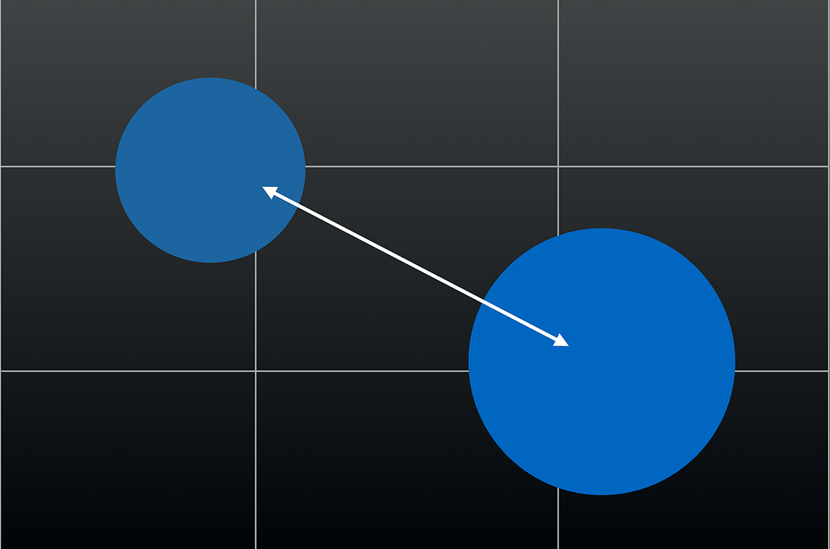
I have been teaching composition on Workshops for years and I find the diagrams below which break it down into its basics the easiest way for most people to grasp. This is composition at its simplest using two very basic principles, POI’s (Points of Interest) and what I call ‘Diagonal Opposites’. Using this as a basis means you really can break composition down into very basic elements. Drag the slider to see how this simple approach can change depending on the scene.
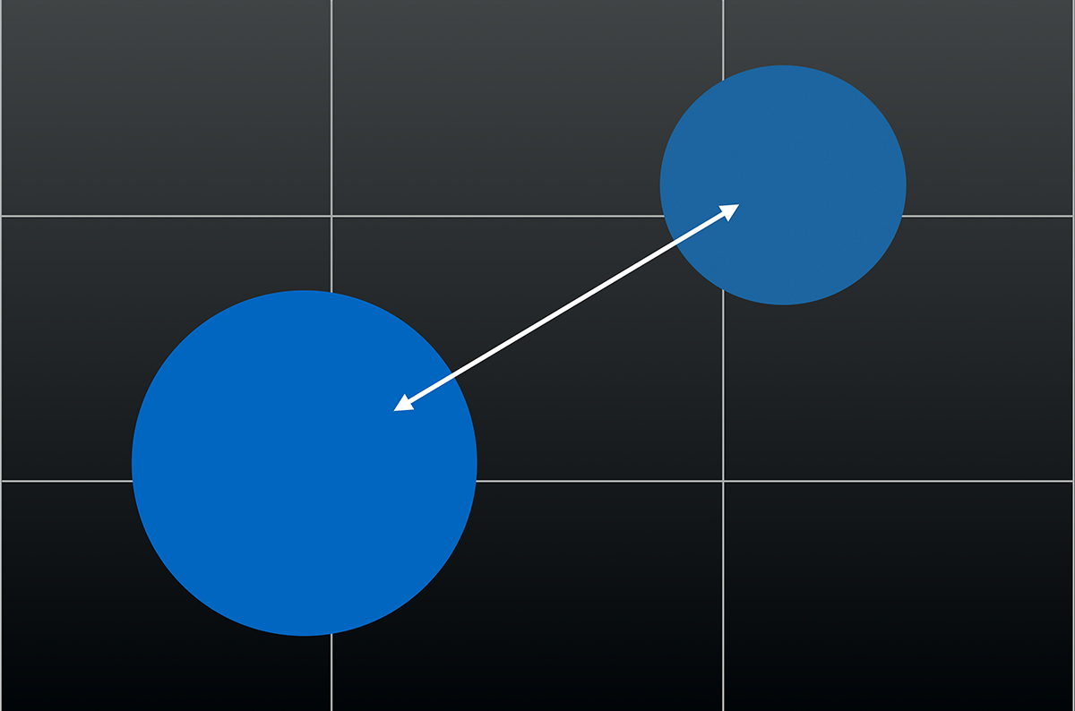
Diagonal Opposites
Subject Scale
DIAGONAL OPPOSITES
Use my theory of Diagonal Opposites as the building block for a composition and you really cannot go wrong. The Rule of Thirds is shown which is another guide suggesting where subjects should be placed. Remember it is a guide, they do not have to be exact, rather it is just a reminder that they should not be central or too close to edges. When two points of interest are placed diagonally opposite you automatically have a lead-in line.
POINTS OF INTEREST – In each scene you are composing try to find two POI’s. One should be more significant than the other and will be the ‘main’ subject or the point you want to guide the viewer towards. The POI’s could be absolutely anything in the scene; a rock and a tree, a cliff edge and a lighthouse, a patch or foliage or water and a hill, a jetty and a boat, a rock in a stream and a waterfall. I could go on but you get the idea. Also ensure each POI has its own space in the frame, too close to edges and the eye can be lead out of the frame.
For illustration let’s suppose the first object is a rock and the second a tree. It does not matter which orientation they are, drag the slider to flip them. By placing two Points of Interest in such a way creates a natural flow for the eye to explore the image. It could be a substantial main subject and a very minor secondary point of interest, such as a distant horizon feature, or even just a setting sun or glow of light.
You can build on this even more with 3 Points of Interest, a third one that is minor in scale placed to complete a triangle for the eye to follow and creating engagement. I often use this technique and I call them ‘Easter Eggs’, a small feature in the distance that is not so obvious and is ‘discovered’, just like an Easter Egg hunt. They can delight the eye and increase engagement.
DIAGONAL OPPOSITES – Position each POI diagonally opposite and straight away you have created a Lead-In line. Lead-Ins do not have to be physical lines, it could be light, or shadow, or even just colour. They are simply parts of an image that will attract attention and will direct the eye to another part of the image. When placing two Points of Interest opposite like this there does not even have to be a Lead-In connecting them, the subjects alone do it. It’s important that they are diagonal in landscape format because the eye moves more naturally across a frame on a diagonal rather than a straight line. When the eye moves across an image in a straight horizontal or vertical line there is more of a tendency for it to wander out of the frame, and you have lost the attention. Conversely in portrait format diagonal opposites still work, but POI’s can be directly in line one above the other, although usually the foreground POI would need to be much more dominant for balance. See below.
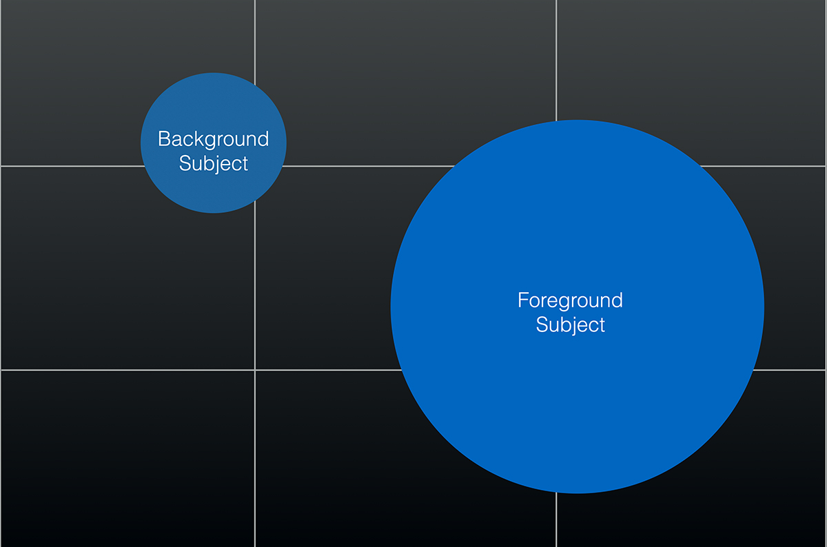
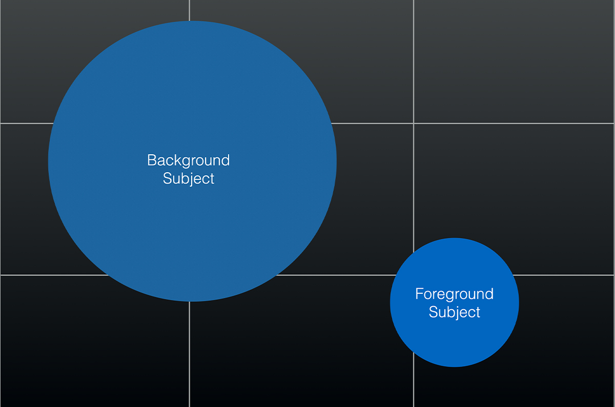
SUBJECT SCALE – In the second diagram the two Points of Interest are different in scale. Your scene will dictate the scale, for example again a beautiful tree and a patch of flowers, or a gate and a background church. Whatever the subject, the juxtaposition of scale of the two Points of Interest will create the engagement.
IMAGE DEPTH – It is also very relevant when considering the depth of the image. Perhaps you are using a wide lens and using two POI’s, one as a dominant foreground interest and the second as a distant background interest for maximum depth. Or you are using a longer focal length to compress the image and bring a background forwards, giving both POI’s equal weight. See ‘Compression’ and the image of Elphin Bothy.
ONE OR THREE?

One Point of Interest

Three Points of Interest
Using diagonally opposite Points of Interest works just as well even if there are more than two, or just one.
ONE POINT OF INTEREST – There may just be one POI or subject in the scene, in which case a lead-in line or depth can still be created. Look for something in the background to draw the eye through, such as the sun during the Golden Hour, sun beams or bright light, a rain cloud break, anything that adds interest and atmosphere to the scene.
THREE POINTS OF INTEREST – When there are three, it starts to get very interesting. Subject scale needs to be considered, and notice how it creates a triangle which is very effective for creating engagement within a scene. The eye flows from one POI to another, and hopefully stays within the image.
VERTICAL ZONES
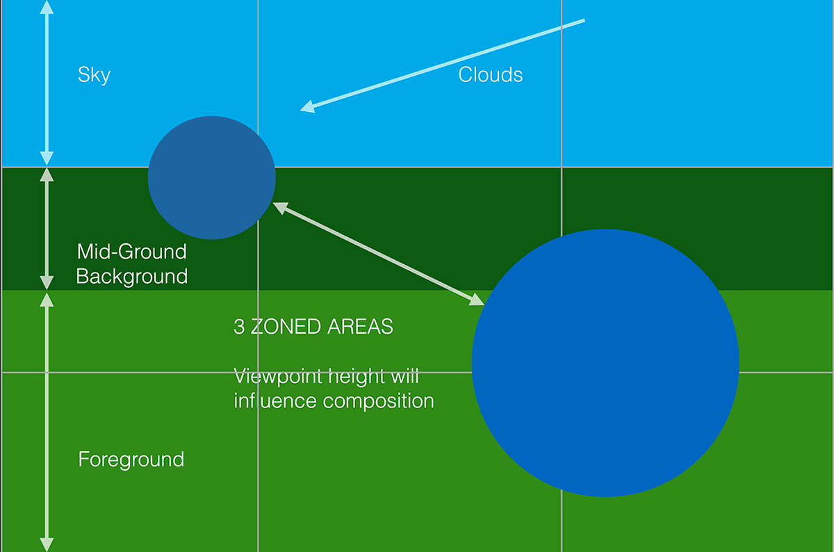
Next to consider are the vertical zones, notice there are three just like the Rule of Thirds. Maybe it’s true nature abhors equal numbers. In every scene there is a Foreground, a Mid-ground and a Background. How you use them will mostly depend on your eye-level and should be considered in your composition. Perhaps in the mid-ground there is a lake or a valley and a low viewpoint will compress or close it up to nothing, when a higher viewpoint will open it up. Again it is very relevant to depth and compression, you may want a wide image with maximum depth, or a long lens to compress the depth and create layers.
GOLDEN RATIO / RULE OF THIRDS
The Golden Ratio, or Fibonacci Spiral is a mathematical ratio, precisely 1.618, and represents proportions that our brains seem hard wired to see as visually more pleasing and natural, probably because it is so prevalent in the natural world too. When a curve is drawn through the intersections it creates a spiral, the Golden Spiral, which you cannot help but recognise in the shape of sea shells, plants, cells, weather systems and even galaxies.
It has fascinated architects, mathematicians and artists for centuries, the Egyptians incorporated it as did the Greeks and Renaissance artists used it too, most famously in the portrait of Mona Lisa by Leonardo da Vinci who was fascinated with the Golden Ratio. Do a search online to see just how much it is used even today in graphic design for magazine layouts, web pages and logo design.

When a square is multiplied by 1.618 and added to it, it creates a Golden Ratio rectangle. Notice how the the rectangle fits within itself again to create further divisions all creating harmony and thus creating the Spiral. We can use these proportions and the Spiral to help with composition.
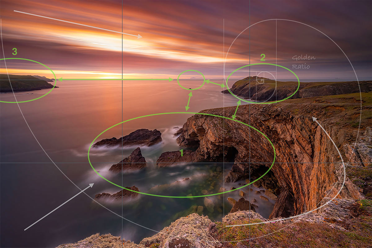
→ TIP Notice in the image below the Golden Ratio is not quite the same as Thirds. In the Menu Cog>5.Grid Settings>Displayed Grid you can select Grid #2 which does actually follow the Golden Ratio more precisely. Personally I prefer Thirds, but try it and see which you are more comfortable with.
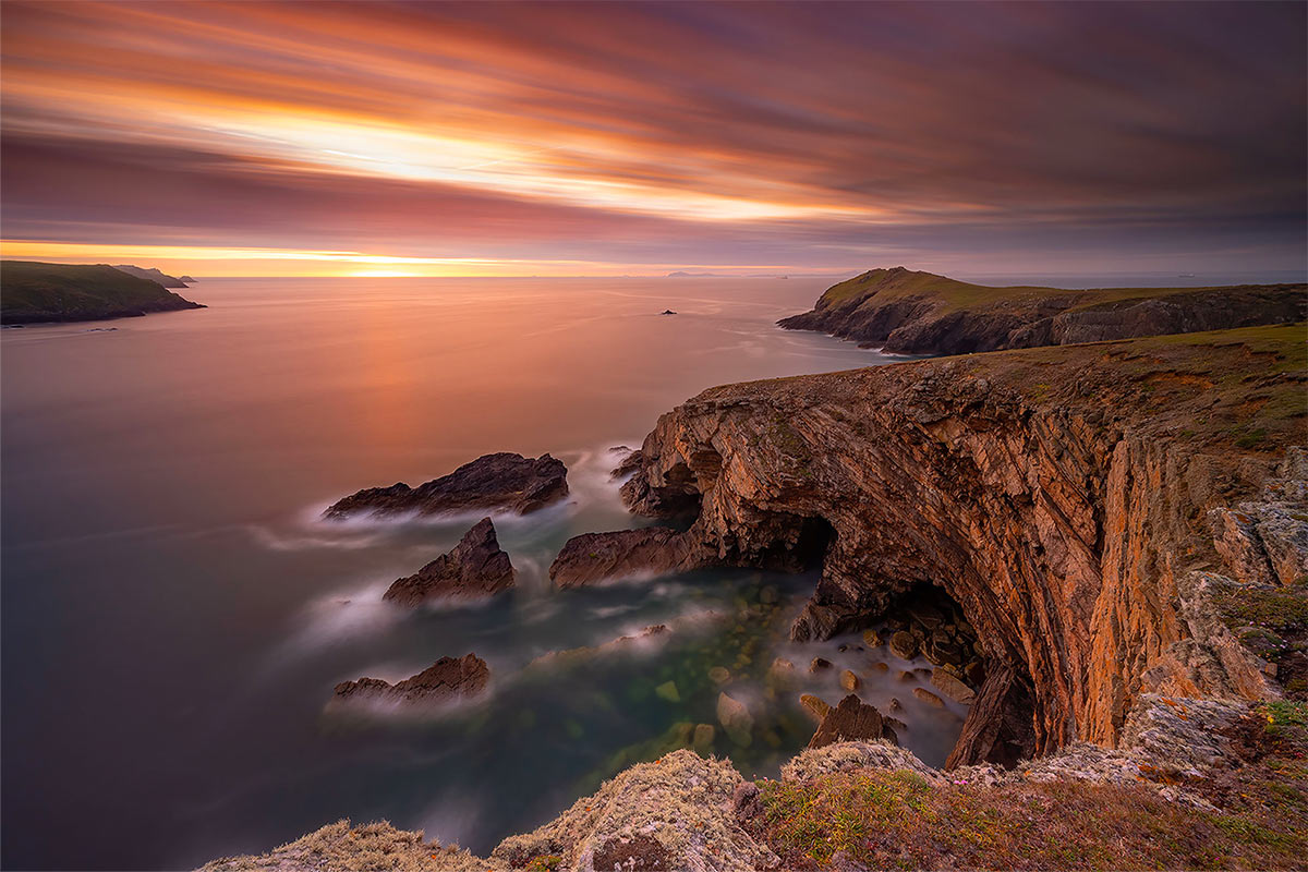
Deer Park Pembrookshire, South Wales-Olympus 8-25mm @ 8mm
The image above taken at Deer Park in Pembrookeshire uses the Golden Spiral with the spiral landing on the headland. The curve of the foreground was included to anchor the bottom of the frame and prevent an expanse of water leading the viewer’s attention out of the shot and it echoes the Golden Spiral leading towards the headland of Skomer Island on the left. The inclusion of Skomer Island acts as a resting place for the eye, an end point as such to stop a viewer’s eye from following the horizon and going out of the scene, the intention was to provide another point of interest and to keep the eye within the frame.
The bright light from the sun is over the Thirds position to balance the sky on the right, and notice the use of lead-in lines from the streaking clouds created with a long exposure pointing back to the headland. In the mid-ground the rocks rising out of the water all appear to lean towards the right with trails of water extending away, all pointing the viewer’s eye towards the headland.
The main focal point is the centre of the image; the main headland with caves to explore visually, rocks under the water and the large rocks to the side rising out of the sea which are all placed above the lower thirds horizontal but below the centre of the image for balance. The line of the caves and the layers of rock all create another lead-in pointing towards the setting sun. Minor Points of Interest as detail help to keep the viewer engaged; in the distance a small rock rises out of the water just below the silhouette of a headland which is Ramsey Island; small detail that is not immediately apparent at first act as surprise ‘Easter Eggs’ only discovered when studying the image, they help to create engagement and discovery.
Use the overlay bar to reveal and hide the annotations and see how the composition engages your eyes. You should I hope be drawn into the image and be engaged by discovering the detail and importantly, without leaving the frame. There are elements that should bring you back into the image.
→ TIP Don’t overly obsess with the Golden Ratio. Whilst there is no doubt it plays a significant part in composition, you will find it comes naturally if you consider the Rule of Thirds. Personally I believe it is a part of nature and with each of us being a part of nature humans are naturally predisposed to the Golden Ratio. Think instead of curves going into your image, balancing Points of Interest and using Lead-In Lines. You will find the Golden Ratio has naturally fitted in.
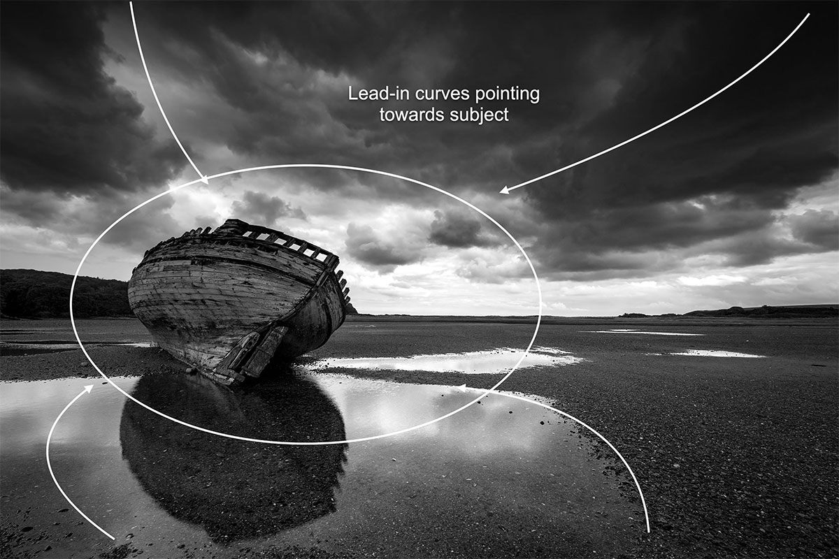
LEAD-IN LINES
Using Lead-In Lines to keep the viewer inside the frame and create depth.
Lead-In Lines are exactly as the name suggests, strong lines pointing into the image to draw the viewer in and create depth. They can be physical lines you can find in the scene, rocks, structures, walls, paths, anything that creates a line. However lead-ins do not always need to be actual physical lines, it could be tones of light, colour, reflections or even how Points of Interest in a scene are balanced as we saw above.

Church Rock North Devon – Olympus 8-25mm @ 8mm

Kylesku Bridge Scotland – Olympus 8-25mm
Both the images above have pretty obvious lead-in lines which can be used to create depth going into the frame. Choosing your viewpoint height has to be considered carefully; too low and the foreground and lines will be compressed (see below), which may actually work. For the Church Rock image my viewpoint was around waist height with the camera slightly angled downwards to exaggerate the lines. The Kylesku Bridge image is taken from a small hill, the elevated height decompresses the curve we see at ground level giving more of a curve.

Roker Pier Sunderland – Olympus 12-100mm

Bamburgh Castle Northumberland – Olympus 7-14mm
Lead-in lines obviously do not have to be straight. Both of these images use a very strong curved line which leads to the main POI. The composition is very simple as it should be when there is a strong line; make it any more complicated and there is a danger of it getting diluted and losing the immediate impact.
Notice also that in each case here I have observed the Rule Of Thirds but have not adhered to it strictly. Why is that? It is a guide, and simply helps to remind us not to place significant parts of an image centrally, or too close to edges. I have noticed over time I do tend to place horizons just above or below the centre, not on thirds, and I am fine with that because it feels balanced. I rarely have 2/3rds sky. On this very page there are a couple of images with the horizon below the centre which is unusual for me; I find no matter how beautiful a sky is I never want the scene to be just about the sky, the foreground should be just as important.
Roker Pier – The main POI, the lighthouse is not on a third, I wanted the viewer to stay within the frame so the lighthouse is positioned off the vertical third towards the centre. It give space to the right and encourages the eye to stay within the image, also guided by the light behind it. The horizon is very central, but not on the centre line to balance the image. I often ignore the thirds for horizons, choosing instead to place it where I feel the scene dictates, but always off centre. If a horizon is placed dead centre it will look unbalanced and will look like an image of two halves.
Bamburgh Castle – Bamburgh is tricky because the land on the right slopes, even when the the sea horizon is straight an optical illusion can still make it look like the image is not level, I have even in the past compensated very slightly by tilting it up. In this case I wanted to maximise the foreground curve and remove any dead space on the right on the sand and the land mass itself. I want the viewer to stay in the image focusing on the castle, the water curve and the line of the clouds, not the space on the right of the castle.
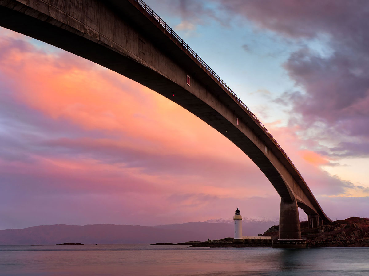
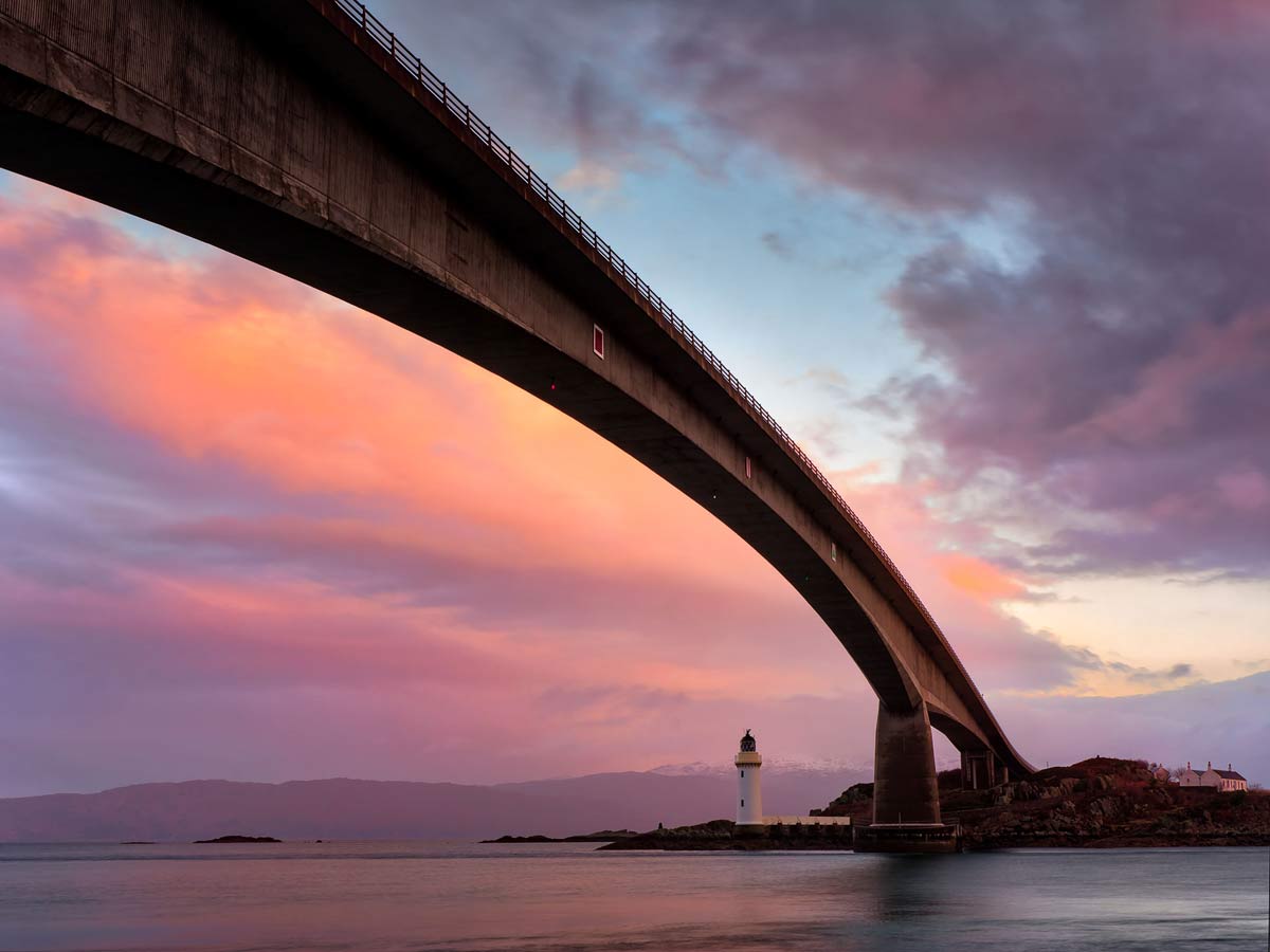
Isle of Skye Bridge – Olympus 12-100mm
Sky Bridge – It’s obvious from this image that the curve of the bridge is the lead-in pointing in to the lighthouse for the viewer to discover. In many situations focal points can be subtle, they do not have to dominate an image. I included the cottages at the side which had some wonderful soft side light from the first light of the day, but in hind sight did I get this right?
Before you read on drag the slider to view the original image and the cropped version, which do you think works better?
I knew something was not quite right and sometimes it can be hard to identify what it is. The cottages although softly illuminated are too close to the edge of the frame and become a distraction, the small gap at the side is awkward and subconsciously attention is drawn to it, we wonder what is just outside the frame. Cropping the image to remove the cottages revealed what was truly wrong with the composition; the bridge cuts the image almost in half. The sky either side of the bridge is too equal and actually looks imbalanced, when having one side larger than the other will create more harmony. I’m also much happier with how the bridge meets the top left corner. Getting it wrong is fine and it is part of the process, understanding why is the key to improving.
LIGHT DICTATING COMPOSITION
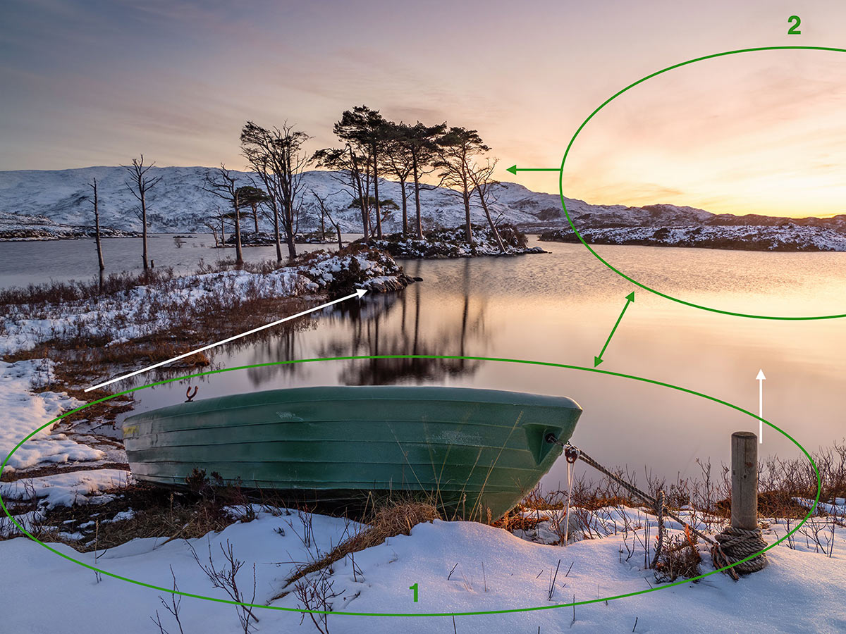
Two images of a row boat on Loch Assynt, Scotland, taken just days apart, one in a blizzard and the other a few days later with a sunset. It is the same scene but the images are totally different, firstly due to the weather obviously, and the light which dictated the composition and framing. Notice where your eye is drawn to in each image.
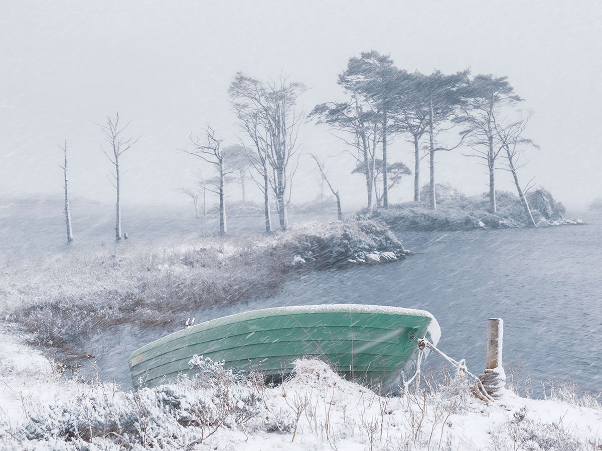
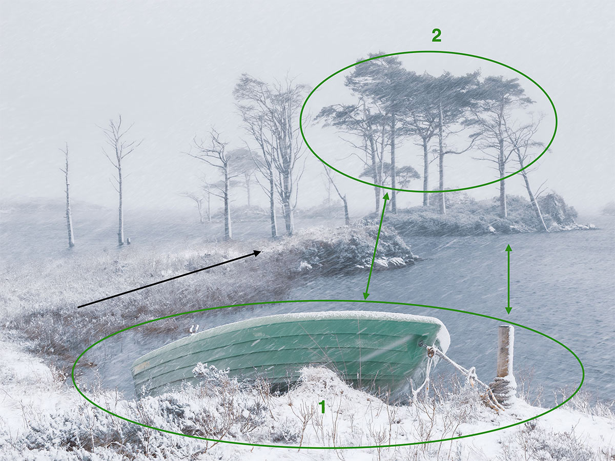
12-100mm @24mm f6.3 1/60s ISO200

12-100mm @12mm f6.3 3.2s ISO200
IMAGE 1 It was a scene full of mood and had to be captured, even if it was freezing. There is a lead-in from the grassy bank pointing out towards the pine trees. Because of the lack of detail in the far background, no hills, no sky, the trees are well separated, so in essence they become a main feature, or Point of Interest. Using a longer focal length capitalised on it by bringing the trees forwards, making two main Points of Interest, the boat and the trees. Small details keep the eye within the frame; the post pointing up to the pine trees, the pine tree leaning into the image, and the two trees on the left which give the viewer a simple detail to explore and stop the eye wandering out of the left side of the frame.
IMAGE 2 Compare image two, taken with a wider field of view. All of the same elements are still there, the grassy bank, the boat and the trees, but the trees are not separated from the background because of the light and clear weather. This image becomes more about the boat, the main Point of Interest or subject, and the bright colourful light, your eye should be drawn from the boat to the light. The post points up to the light, and a line of grass under the boat is a small but powerful lead-in towards the light.
NOT SO OBVIOUS LEAD-INS
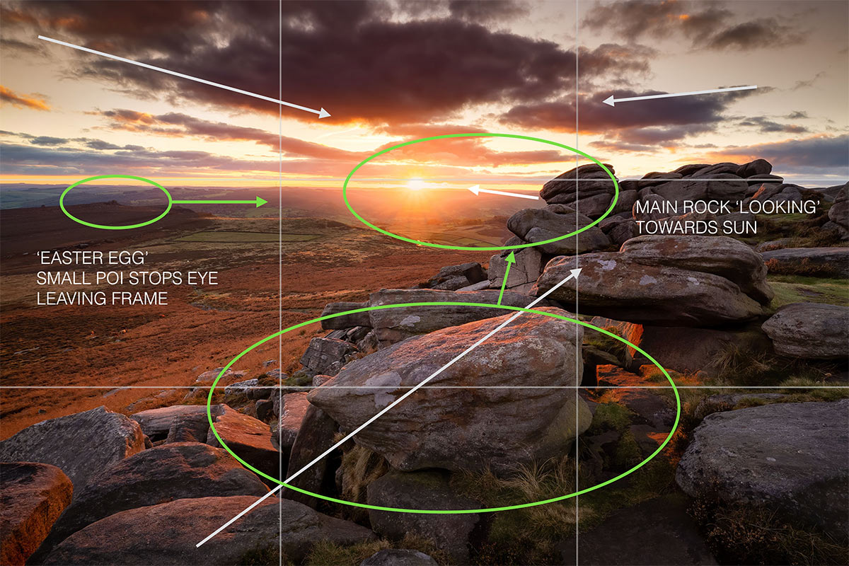
This image of the Peak District has a strong lead-in, guiding the viewer into the scene but it is not as obvious as the image of Church Rock above. The edge of the cliff running diagonally across the image leads the eye naturally up to the top rock placed just above the horizon. The large rock in the centre of the frame acts as a main Point-of-Interest because of the light illuminating it; it naturally leads to the rock at the top placed on the horizontal and vertical thirds. Notice the other large rocks on the bottom edge of the frame and the right corner which serve to ‘anchor’ the bottom of the frame.
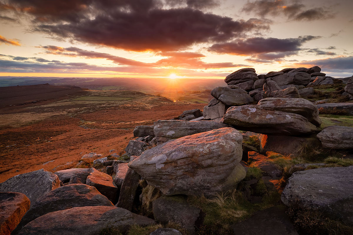
Peak District – Olympus 8-25mm @ 8mm
POINTS OF INTEREST There are three main points in this image, the rocks as mentioned above which act to draw attention in, and the sun which is a very obvious POI.
EASTER EGG A third very minor Point of Interest on the left, a small peak which is the silhouette of Over Owler Tor, acts as another ‘anchor’ to stop the eye following the horizon out of the frame. Small details like this can really help to keep the viewer engaged and provide discovery. Sometimes referred to as Easter Eggs, they are small details that are not obvious and need to be discovered, or found, just like a hidden Easter Egg.
Notice also there is a subtle path leading from Over Owler Tor back towards the centre of the image. Points-of-Interest can be used to guide the viewers eye, to create lead-ins and also to act as a place for the eye to stop. Imagine a written sentence on a page with a Full Stop. We know instinctively the (.) means stop, pause, end. A small detail on a horizon can serve the same purpose telling the eye to stop when it reaches it. If your image is strong enough the eye should return back to another POI without following the horizon out of the frame.
HOLY ISLAND
Dawn on Holy Island, a difficult place to synchronise crossing times onto the island because of tides, sunrise, and of course the light. I got very very lucky this particular morning when it all came together. there is a very obvious lead-in line from the fence catching the light, but what else?
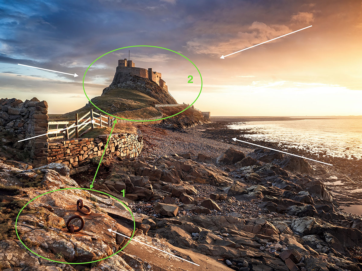
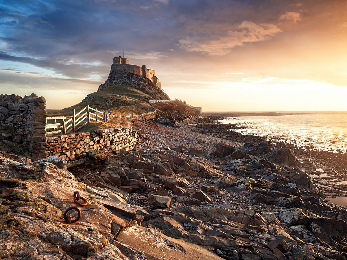
Holy Island – Olympus 8-25mm @ 16mm
POINTS OF INTEREST Lindisfarne castle is the main Point of Interest obviously. It is the hero of the image and so it should be. The iron rings, once used to tie moored boats are another, and happily they form a line pointing directly to the castle. The sunlight illuminating the rings and the rock helps to fill the bottom left corner of the image.
There is another POI, the bright light from the sunrise. I usually prefer to have the sun out of the frame, it can be nothing more that a bright or even blown out ball that is a distraction, just having the light is enough. When the sun is far enough and out of the frame it will give beautiful side light, much better than having the subject silhouetted. That light should draw the eye out of the image, but it doesn’t because there are lead-in lines pointing back in again.
LEAD-IN LINES Firstly the obvious one, the fence and stone wall which leads into the castle. It twists all the way in giving depth to the scene. The rings as already said give a lead-in because of how they are arranged, and the angle of the rock face catching the sunlight lead up to them. That light draws the viewers eye towards it, we are naturally drawn to light as humans, otherwise we would be voles. Does it draw the eye out of the image? I don’t think so, the angle of the water points back towards the castle, and I waited for an approaching cloud which came just in time to give another lead-in to the castle as it caught the light.
You may be thinking what if I had made more of those rings, or used them as a stronger element in the image? You’re absolutely right, and I have done it previously. See below:
FIELD OF VIEW
Focal length is going to alter your compositing drastically, that much we have seen. Compare the two images below, one taken at 8mm and the other taken at 18mm. The field of view changes drastically, most noticeable here in the foreground.

Field of View Diagram from 7mm to 100mm
The diagram above represents the changing field of view with different lens focal lengths. At 7mm the view is ultra wide at 106 degrees, whilst at 12mm it is 84 degrees. It is pretty obvious you will have less in the frame at a narrower focal length and you can always move back. The focal length changes characteristics though even if the same scene was taken with the same framing; wide angle lenses exaggerate perspective making foregrounds more dramatic, and push background further back, longer focal lengths flatten perspective, compressing the scene and pull backgrounds forwards.
→ TIP Wide angle lenses are great for landscapes because of how much they exaggerate perspective, but do make sure you are filling the foreground to make the most of it. You often see people say just use a standard lens and stitch two images together for a wide view, it does work but isn’t the same, close foreground will not be exaggerated as much and stitching would fail anyway.

8mm FOV

16mm FOV
These two images demonstrate the differences in field of view. Ignore the difference in light, we are more concerned with composition. The first image is considerably wider at 8mm and very close to the first ring. The perspective is exaggerated and the castle recedes further back. The second image was taken at 16mm with the scene more compressed, the rings are not as dramatic and the castle is pulled forwards.
Which is best? You decide, there are arguments for both. While the rings present a great lead-in in the first image, in the second they are more subtle and the castle is the hero of the shot. Experiment and don’t settle for your first instinct, there is always another way.
LEAD-OUT LINE
Lines leading out of an image are not what we want, it’s counter to the objective of keeping the eye in the frame. the scene at Penmon Point was very attractive with some wonderful tones in the sky. I opted for a long exposure to make the water soft and misty, but that line of rocks was troubling. How did I alter composition to negate it and keep the viewer’s eye in the scene?
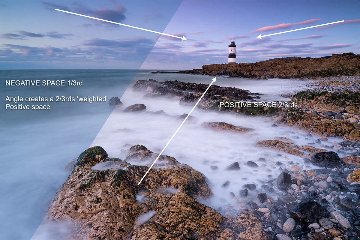
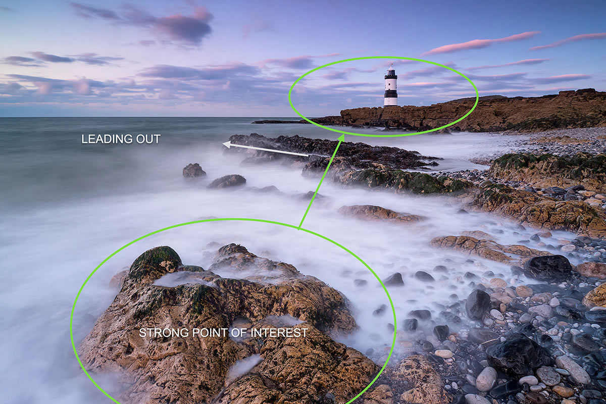
Penmon Point, Anglesey – Olympus 7-14mm @ 7mm
Carefully choosing my composition I decided on two Points of Interest, the lighthouse being one obviously and the large rock in the foreground the other. Placing them diagonally opposite creates a lead-in or an eye movement from one to the other; the rock is sufficiently large enough to attract interest.
There are lead-in lines from the clouds which point into the scene and the lighthouse too.
Now drag the slider; the empty space on the left is Negative Space, it is more or less empty of any interest. By choosing my viewpoint I ensured the negative space is 1/3rd, with the positive space 2/3rds. It creates balance and harmony, again with nature abhorring equal numbers. And there is an angle or a wedge shape of the space, leaning into the image not out. Because the positive and negative spaces are balanced harmoniously it negates the effect of the line of rocks leading out. That empty space ends up working in my favour because it also give the lighthouse space to ‘look’ into.
POINTS OF INTEREST
Using Points of Interest to create Lead-Ins and engagement.
Points of Interest are a great way to create or enforce lead-in lines. Using one main and a secondary POI, or even three, allows the viewer to explore the scene and allows you to guide where the eye actually goes. Which is the main, and which is the secondary POI? Counter to intuition, the main POI does not necessarily mean the biggest. In the image above of Penmon Lighthouse it is the lighthouse itself which I regard as the main POI; the rock in the foreground is simply foreground interest and a guide. Think of POI’s as the main and the supporting act; which is which depends on the scene. .
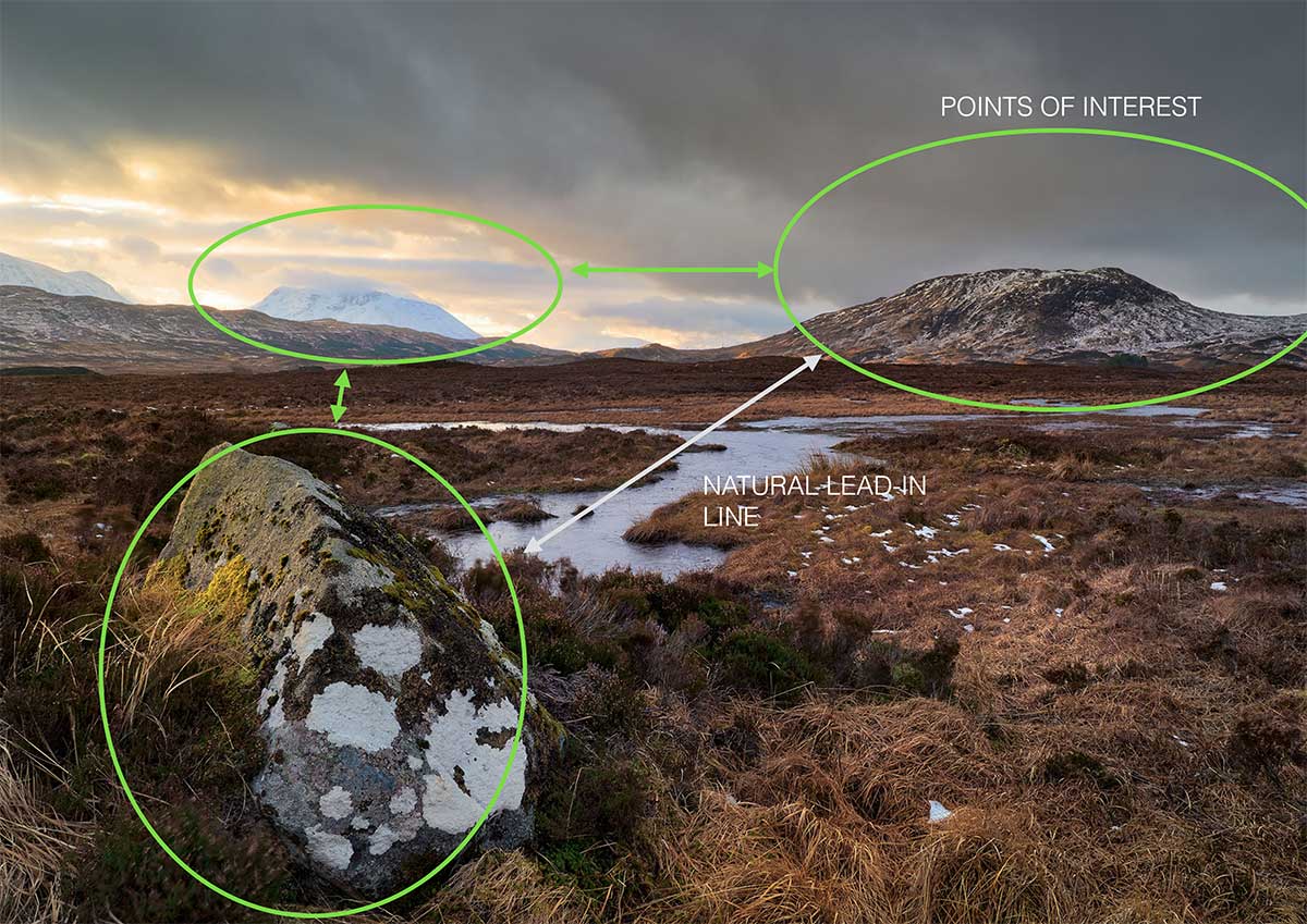
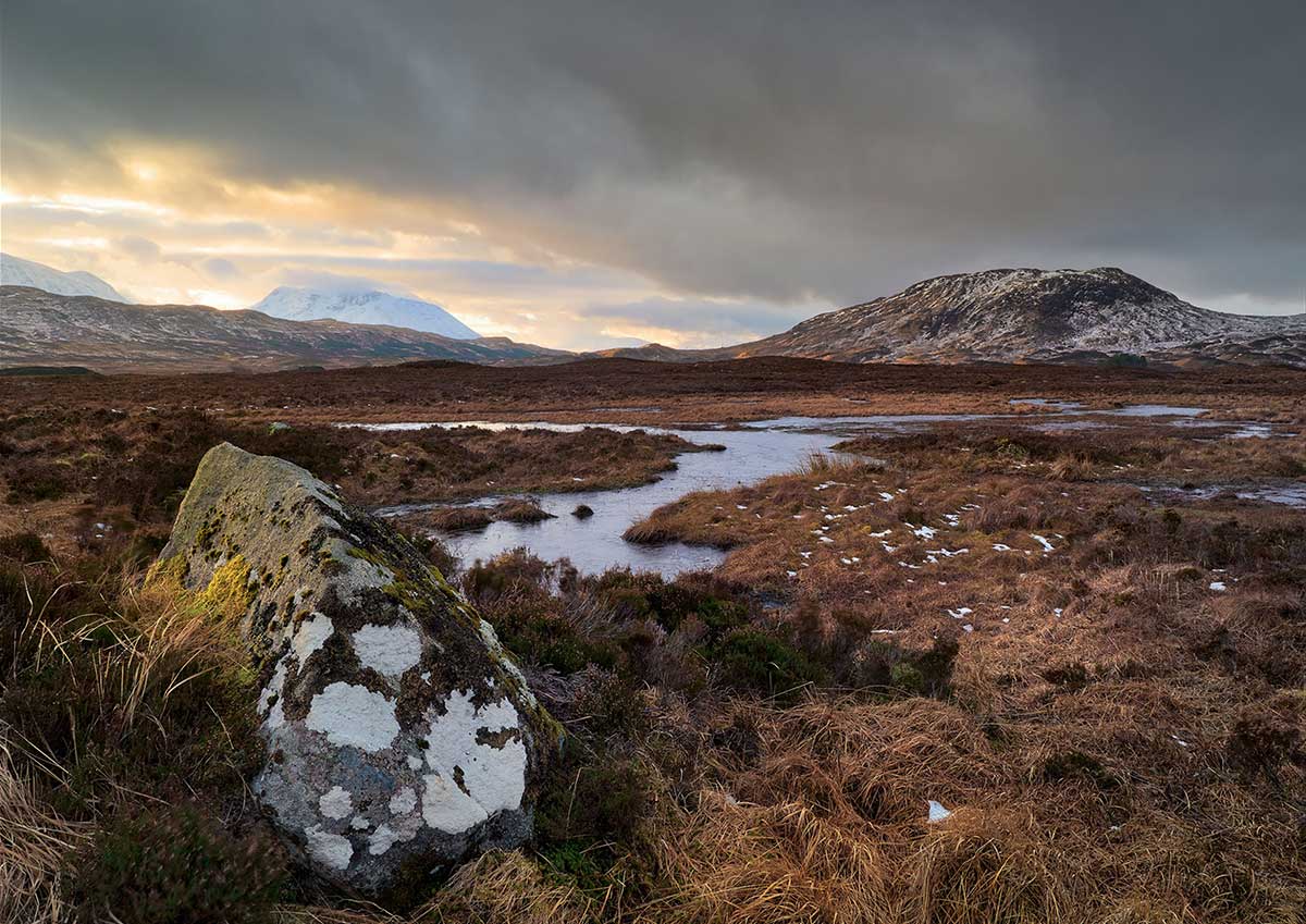
Rannoch Moor, Scotland – Olympus 12-100mm @ 12mm
Before you drag the slider how many Points of Interest are there in this image?
There are actually three, but two main POI’s, the rock with the wonderful textures and the hill in the background. Choosing my composition I was able to use the water as a lead-in between the two. The third POI is the snow covered hill in the background. It doesn’t dominate and so doesn’t detract from the two main POI’s, but it does provide further interest and engagement, and completes a triangular flow within the image.
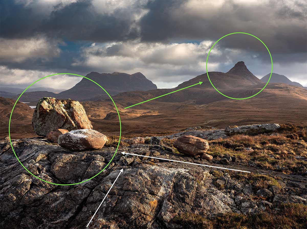
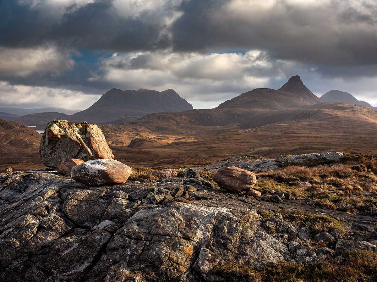
Stack Pollaidh, Scotland – Olympus 12-100mm @ 12mm
A very similar situation with this scene from Assynt in Scotland.
The large rock on the left catching the light is the main POI with Stack Pollaidh being the second POI. Interestingly the rock ledge slopes upwards creating a subtle lead-in line, as does the face of the ledge which has cracks and lines point up and into the image. In the mid-ground the colour of the landscape, all dark orange bracken, creates a subtle but distinct band leading across and up to the mountain.
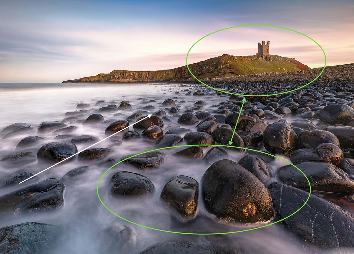
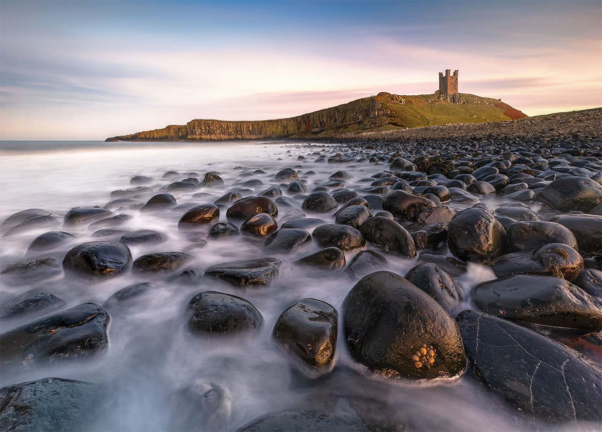
Dunstanburgh Castle – Olympus 8-25mm @ 8mm
A 50 second exposure at Dunstanburgh Castle in Northumberland. Known as the ‘Death Rocks’ because they are so slippery I have been there a number of times without issue. This time they got me and I took a tumble, landing in the water with my knee on a rock. The camera was saved by an L-Bracket although my knee took 3 months to recover.
There are two points of interest, the foreground rocks, and the castle. I searched for some rocks with detail and found these with a great cluster of limpets. The rocks also provide a simple lead-in, angled up towards the castle. Shooting it as a long exposure not only makes the water soft and dreamy, it separates them and allows them to stand out.
CENTRAL PLACEMENT
There are times when a composition needs the subject placed centrally, and so far we have learned it is wrong. But are the times when it is acceptable?

Lone Tree, Malham Yorkshire – Olympus 12-100mm

Lake District – Olympus 7-14mm
KEEP IT PURPOSEFUL
Of course there is, in fact sometimes it just would not work any other way and would be awkward. The Lone Tree above had to be centred with the lead in lines of the rocks pointing to it. The washed up brain in the Lake District is balanced because of of the scale compared to Derwent Island in the background.
The key point here is to make it PURPOSEFUL. Images like this work because the composition is simple and very deliberate. Don’t be afraid to break the rules but you must be aware of it and have a purpose for doing so.
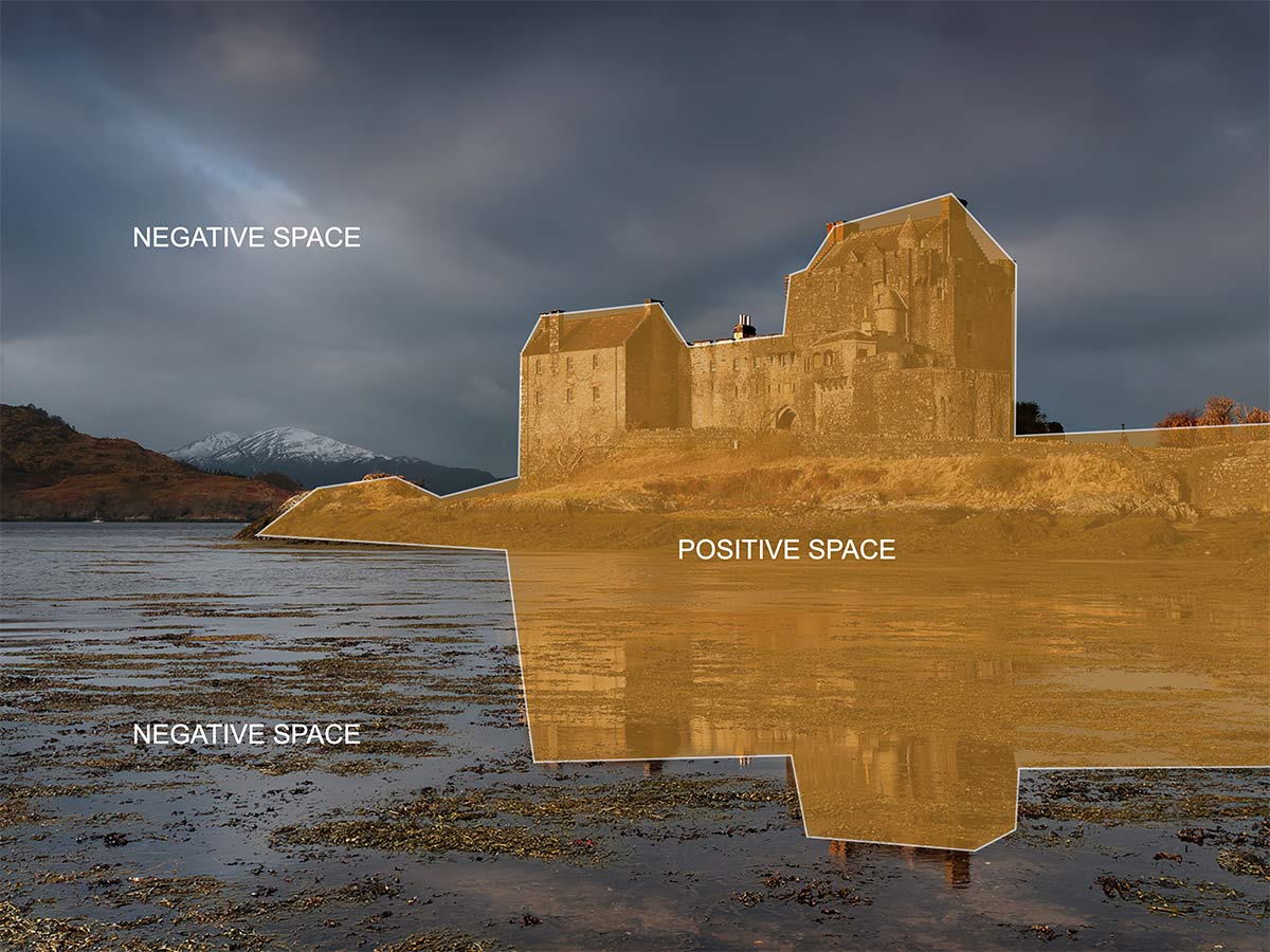
POSITIVE & NEGATIVE SPACE
Balancing Positive and Negative Space.
I’ve mentioned Positive and Negative space but what is it?
We can regard positive spaces as areas that are dominant in the image perhaps because of detail, colour or tone. Negative spaces are those that have little or no detail, or tones that tend to merge into one making any detail less significant.
In this image it is pretty obvious that the positive space is the rocks and the lighthouse, the negative space the rest of the image. Despite the subtle detail in the sky and the lead-ins pointing to the lighthouse it is similarly toned.
Balancing the spaces is best in thirds; the positive space is around a third and the the negative space two thirds. It will always create more harmony than a 50/50 split.
Sometime the positive and negative space is very obvious especially with large bodies of water and long exposures flatting it. There are time however when it is much more subtle.
Interestingly, harmony is achieved if the positive and negative space is 1/3rd and 2/3rds. There’s those thirds again.

Portland Bill Dorset – 12-40mm @ 20mm
Notice the composition here doesn’t use the Rule of Thirds. The horizon is just off centre which is fine and the lighthouse is positioned where I want attention to be, but not dead centre. If anything I would have liked a higher viewpoint to open the rocks more and extend them further down to the right corner, without moving the horizon. I was as high as I could be considering the wind.
USING SPACE
Using Negative Space works best in images when there is…space. Both of these images have a similar concept, peace, tranquility and space, and both were taken at first light. A longer focal length is used to compress the scene and eliminate any foreground.

Bamburgh Beach – Olympus 12-100mm @ 45mm

Lake District – Olympus 12-100mm @ 20mm
Both images also have other key elements in common too, there are very subtle lead-in lines and both also have a secondary POI or ‘Easter Egg’.
Bamburgh Beach – The left has a water line pointing to the secondary POI, the dog walker. The positive space on the right, the castle, reflection and dark tones all direct the eye back into the image and the dog walker. It was a slow shutter obviously from the water on the right, so how did I get the dog walker sharp? Another frame was taken with a faster shutter speed and then blended together.
Lake District – I was careful to ensure the mast and the reflection were in the frame without cutting it off, which guides the eye to the boat. Subtle detail in the east bank of the lake visible in the mist gives added interest and a dead tree branch gives a secondary POI, again an ‘Easter Egg’. It is not immediately apparent, it encourages discovery and stops the eye wandering out of the image. I was very careful with the tones in processing, wanting the blues on the right to be retained; the shape of the tones gives a very subtle harmonious balance with the warm tones weighted on the left almost oval in shape, and the blues on the right. The boat is central in the warm tones, giving more weight to the subject.
SUBTLE NEGATIVE SPACE
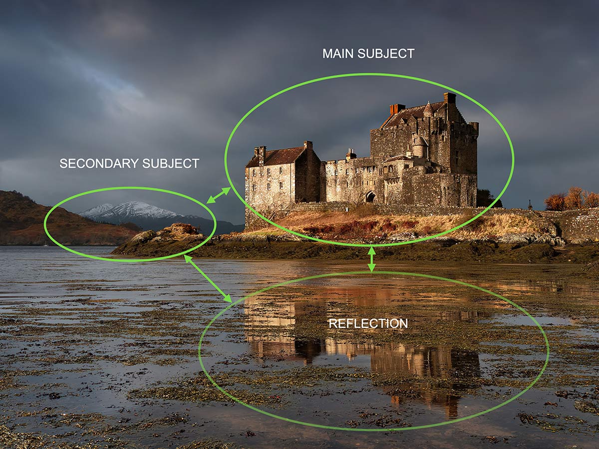
Sometime the positive and negative space is not as obvious as the image of Portland Bill. This image of Eilean Donan Castle was a lucky break. The heavy grey sky suited the mood of the location and the warmth of the light on the castle gave some wonderful colour contrast. At low tide there was rather a lot of seaweed disturbing the reflection, but the light was strong enough to accentuate it. I was aware that the castle and the reflection are the dominant parts of the scene, the positive space. The surrounding space is negative; even with the seaweed the water becomes almost the same tone as the sky.
Making sure the main part of the castle was on the vertical third allowed me to balance the spaces, 1/3 positive and 2/3 negative. The castle takes just under 2/3rds of the space from right to left leaving 1/3 space for the snow covered mountain in the background. Watching the sky I got lucky with a subtle break in the clouds which gives a lead-in to the castle.
A problem was the horizon, or the lack of a defined one. Is it the water line under the castle, or the water line in the background? The castle is the hero of the image and that dictated the position for me; the bottom of the reflection is near the lower edge but away from it to give space and lead the eye in. The space between the top of the castle and the top frame edge is substantially more to make the most of that wonderfully toned sky, so the ‘horizon’ falls naturally where it is. having the spaces at the top and bottom of the castle anything close to equal would have ruined the composition.

Eilean Donan Castle, Scotland – Olympus 12-100mm
Making sure the main part of the castle was on the vertical third allowed me to balance the spaces, 1/3 positive and 2/3 negative. The castle takes just under 2/3rds of the space from right to left leaving 1/3 space for the snow covered mountain in the background. Watching the sky I got lucky with a subtle break in the clouds which gives a lead-in to the castle.
A problem was the horizon, or the lack of a defined one. Is it the water line under the castle, or the water line in the background? The castle is the hero of the image and that dictated the position for me; the bottom of the reflection is near the lower edge but away from it to give space and lead the eye in. The space between the top of the castle and the top frame edge is substantially more to make the most of that wonderfully toned sky, so the ‘horizon’ falls naturally where it is. Having the spaces at the top and bottom of the castle anything close to equal would have ruined the composition.
Eilean Donan Castle, Scotland – Olympus 12-100mm @ 12mm
There is one main point of interest, the castle obviously, but the reflection is also a point of interest. The snow capped monition in the background, which is actually on the Isle of Skye, is a secondary point of interest. Put them all together and we have a triangular flow within the scene.
Drag the slider to see the negative space. Although the foreground and the seaweed is not quite negative we can still regard it as this when looking for balance, the castle is approx 1/3rd the image area and the rest of the space is 2/3rds. It is another way we can strive for balance and harmony in a composition.
ENVIRONMENTAL NEGATIVE SPACE
Mist is the perfect natural opportunity to make the most of negative space because it wipes out background detail, creating layers, such as this image of the Duke of Portland Boathouse on Ullswater in the Lake District.

Ullswater, Lake District – Olympus 12-100mm
It isn’t exactly 1/3 and 2/3 which I am fine with, the proportions are unequal and that is what mattered. Also notice my horizon, it is just below centre which I tend to do often. The balance felt right, not too much sky and not too much water.
KEEP IT SIMPLE
Keeping the composition simple

Spurn Point Breakers – 12-100 Pro @ 34mm

Mumbles Lifeboat Station – 12-100 @ 20mm

Spurn Point Breakers – 12-100 Pro @ 40mm
Sometimes keeping the composition simple is desirable. In this series of minimal images the subject is obvious and they are the ‘hero’ of the shots. The intention was to create very minimal fine art images in a square format. When a subject dominates the image in a very purposeful way ‘rules’ can be broken. I removed horizons to create an infinite feeling, with brighter light to create depth, and yet where the horizons should be is almost central in the frames. The subjects on image 1 and 3 are also central in the frame.
Minimal images such as these rely heavily on the use of Negative Space; the empty space around the subject is as important as the subject itself.

12-100 Pro 200s Exp 10 Stop External ND Live Time
This image of Sango Bay in the far North West of Scotland of a sea stack and two rocks was taken as a long exposure for misty water. The two rocks naturally point in towards the main subject which is placed almost central horizontally and vertically.
It breaks the rules, shock horror. But it works for two main reasons; firstly it is purposeful, the subjects are strong and the square format means they balance well. Imagine if they were 3:2 instead? They would still work because it is purposeful, there has been an obvious decision. Secondly is the space, or the negative space around the subjects. Despite the fact that there is detail around the subjects by way of light, shade, reflections, cloud movement, it is all subtle, and it forms the negative space to balance the positive space and creates harmony.
ONE POINT OF INTEREST
Keeping it simple does not mean keeping it minimal, it is more than possible to have a dramatic scene with one POI, like this old boat wreck on Anglesey, Wales.
Dullas, Anglesey-8-25mm @ 8mm
Waiting patiently on a rainy wet day with thick clouds paid off. I’d chosen my composition with the boat and the reflection mirroring each other. I got lucky with the clouds too eventually. Drag the slider to see how the lead-in lines all curved into the hero of the shot.
PORTRAIT ORIENTATION
Composing in Portrait orientation.
I had a look back through my Lightroom catalogue and estimated roughly that 70% of my landscape images are in portrait. It didn’t surprise me because I love using portrait, I like the juxtaposition of foreground and background and how I can lead the viewer’s eye up into the frame. There is a constraint with the width of the frame which means using the height of the frame instead.
The same rules of composition apply, lead-in lines, rule of thirds, positive/negative space, Points of Interest etc. But I find I can break the rules too.
VERTICAL POINTS OF INTEREST
Dead pine trees on an island in Loch Assynt on a freezing cold winter day. Yet another blizzard was heading in which was handy for me because it softened the background, allowing the twisted organic branches to stand out.
There were many ways I could have composed this, in fact another frame taken in landscape was just the island and tree, nothing else.
I decided for this image to include the foreground rock (focus stacked) with a low viewpoint and at 40mm so it filled the frame and compressed the scene. I was careful to ensure I did not compress, or close up the mid-ground with my viewpoint height, so I could retain the slight reflection.
There is an obvious lead-in from the rock up to the tree just using Points of Interest, which is also helped with the reflection. It increases depth too, going into the image. But, it has a vertical lead-in, and lead-in lines should always be diagonal, never vertical or horizontal.
I broke the rule because the scene dictates it. There are two POI, both are placed centrally (again wrong) in the frame giving balance, the size of each one creates balance, and the space around each creates harmony.
Imagine if I had tried to place the tree and rock diagonally opposite? It just would not have worked. learning to read the scene and let it dictate the composition is important.

Loch Assynt Scotland – 12-100 Pro @ 40mm
LEADING THROUGH
A winter scene on Loch Bad a Ghaill, Assynt, on a sunny day. As I said, one of the reasons I love shooting portrait orientation is the opportunity to make strong foregrounds that lead through the image.
Here a group of rocks gave a great opportunity to create a composition that would fill the foreground. Altering my eye-level so the camera was just above wait height meant the mid-ground was not empty, in effect closing down the empty mid-ground.
Using the wide lens meant the background mountains receded to much so I set it to 15mm bringing them forwards enough to balance the composition.

Loch Bad a Ghaill – 8-25 Pro @ 15mm
STRONG FOREGROUND
I do love a black and white image, there is something pure about allowing an images to speak without the distraction of colour, letting the tones, light and shapes do the talking.
As I said, with portrait orientation I love how the viewer’s eye can be directed vertically in an image.
This example of St Marys Lighthouse in Whitley Bay demonstrates it. The subject is quite some distance away which means I can play with depth. The lighthouse had brief moments of catching the sun so it was a great opportunity to create a dramatic image.
The rocks, the textures and patterns dominate the foreground. The lighthouse is the subject of the image, but it is secondary to the rocks, just as I wanted. There is a natural diagonal from the angle of the rocks, leading up to the headland, which in turn leads the eye back into the image towards the lighthouse.
Using a long exposure of 20 seconds gave some drama in the sky and flattened the water, allowing the textures of the rocks to stand out. And it also allowed me to catch the fleeting light on the lighthouse.

St Marys Lighthouse – 12-100 Pro @ 12mm

Slicachan, Isle of Skye – 8-25 Pro @ 8mm

Embleton Bay – 8-25 Pro @ 8mm
These two images could not be more different, one is full of drama, the other far more tranquil.
Sligachan – Capturing the drama with a 1/6th shutter speed for detail on the water, the angle draws the viewer up and into the image. The Cuillin Mountains are central with enough space either side to show the drama of the sky. The clouds all angle in towards the mountains and the sunbeams also point in, creating a curved lead-in all though the image; from the bottom left, up diagonally and around to the sunbeams.
Embleton Bay – A very simple composition using a 40 second exposure to flatten the water. Flattening it adds to the tranquility of the scene and separates the rocks allowing them to stand out. The main direction of the rocks points diagonally towards the headland, which in turn points to the reflected colour in the sky from setting sun behind me.
COMPRESSION
Using Compression in compositions.
DEPTH COMPRESSION
When we talk about ‘compression’ we naturally think about the use of longer lenses which have an inherent quality of flattening elements of a scene. Parts of the scene in the mid-ground and background are brought forwards and perspective is shortened dramatically, as in the images below.
Juxtaposition of scale between the foreground and background elements can be equalised much more, making for interesting compositions. And when distant hills are in a scene ‘layering’ is apparent. Using a narrow field of view such as 100mm will really flatten perspective, however it is also obvious at wider focal lengths too. See the two images of Lindisfarne Castle.

Castle Stalker, Scotland – Olympus 12-100mm @ 50mm
A lucky break with a rainbow right over Castle Stalker. Using a longer focal length for compression and isolation of the subject.

Snowdonia, Wales – Olympus 40-150mm @ 100mm
A scene over the hills at dawn from Glyder Fach in Eryri (Snowdonia). A long lens flattens and ‘layers’ the hills.

Wailing Widow Waterfall, Scotland – Olympus 12-100mm @ 40mm
40mm flattens the depth, pulling the waterfall forwards and balancing the size with the snow and ice covered rock in the foreground.

Meols, Wirral – Olympus 40-150mm @ 100mm
A long focal length used to pull the background boats forwards. I particularly like the blurred boats contrasting with the single sharp boat.

Inner Farne Island, Northumberland – Olympus 40-150mm @ 150mm
Warm golden light on the dune grass contrasting with a dark thundery sky. Patience paid off waiting for light to illuminate the lighthouse approx 1 mile away. At this kind of compression the grass only 2-3 meters away was never going to be in focus, which is what I wanted anyway.

Ben Stack, Scotland – Olympus 12-100mm @ 40mm
The winding road to Ben Stack in the highlands of Scotland, taken with a narrow field of view to compress the curve.

Wild garlic- Olympus 12-100mm @ 70mm
A scene from the woods and what a scent, it’s intoxicating. Tree stumps used as foreground for the wonderful background light with lens compression.

Cul Beag, Scotland – Olympus 40-150mm @ 110mm
Cul Beag in Assynt covered in snow. There is actually some distance between the hill in the foreground, which stands out well because of the low clouds cloaking the mountain. A quick change of lens to capture the wonderful light.

Elphin Bothy, Assynt – Olympus 12-100 @ 40mm
Elphin Bothy with the mighty Silvan in the background. Side light illuminated the mountain beautifully, to make the most of it a longer focal length was used to compress the scene and bring the background forwards. the bright light in the clouds means the eye moves in a triangle around the scene.
VIEWPOINT COMPRESSION
Compression from choice of lens should be fairly obvious, and it should be considered just as much when using wider lenses. Consider the compression of the foreground and mid ground simply by varying your viewpoint height. Getting down really low can add drama to elements in the foreground, but it will compress the mid-ground.
A low viewpoint is obviously best when the intention is to make a bold statement with a foreground subject, such as these fungi in Autumn. Low and close really makes foregrounds dramatic.
Getting so low has it’s own challenges, getting back up again! Note what happens to the mid-ground, it closes up to almost nothing which was the intent. I wanted the subjects to dominate the foreground leading up to the wonderful light behind the tree. That white light from mist separates and layers the background, giving just enough detail for interest and allows the eye to be drawn into the scene.

Shrooms in Autumn- Olympus 60mm Macro

Lake District – Olympus 12-100mm @ 12mm

Meols Beach, Wirral – Olympus 12-100mm @ 12mm
The image on the right of a marooned boat at Meols on the Wirral had wonderful texture in the sand which would have been more dramatic with a lower angle, but the mid-ground would have closed up more resulting in the mast being lost. In this image I should have moved a few inches to the left to allow a little more space for the end of the mast. Perhaps I will nail it next time. Being aware of the smallest detail really does matter.
The River Brathay image on the left had to have the mid-ground considered carefully. I needed just enough space to allow for the cloud reflecting on the water and to separate the grasses; being too high would have lost the foreground detail, and being too low would have lost the separation between water and grasses.
Always consider your viewpoint height, perhaps you want to compress the mid-ground, or want to open it up. Think of the scene in terms of three zones, foreground, mid ground and background, and balance them to suit the scene.
MOOD & LIGHT
It’s all about the light.
Lastly and most important of all is the light. Or the lack of it. A good image has to have mood; it should be evocative and stir an emotion, whether it is an uplifting sunset or sunrise, or a dark stormy day. The best composition is a waste of time if there is no mood. This image from Derwentwater in the Lake District was taken just as a storm kicked in. I have seen low water, high water, calm water and rough water, but I had never seen waves as rough as this on a lake.
NIGHT MEETS DAY
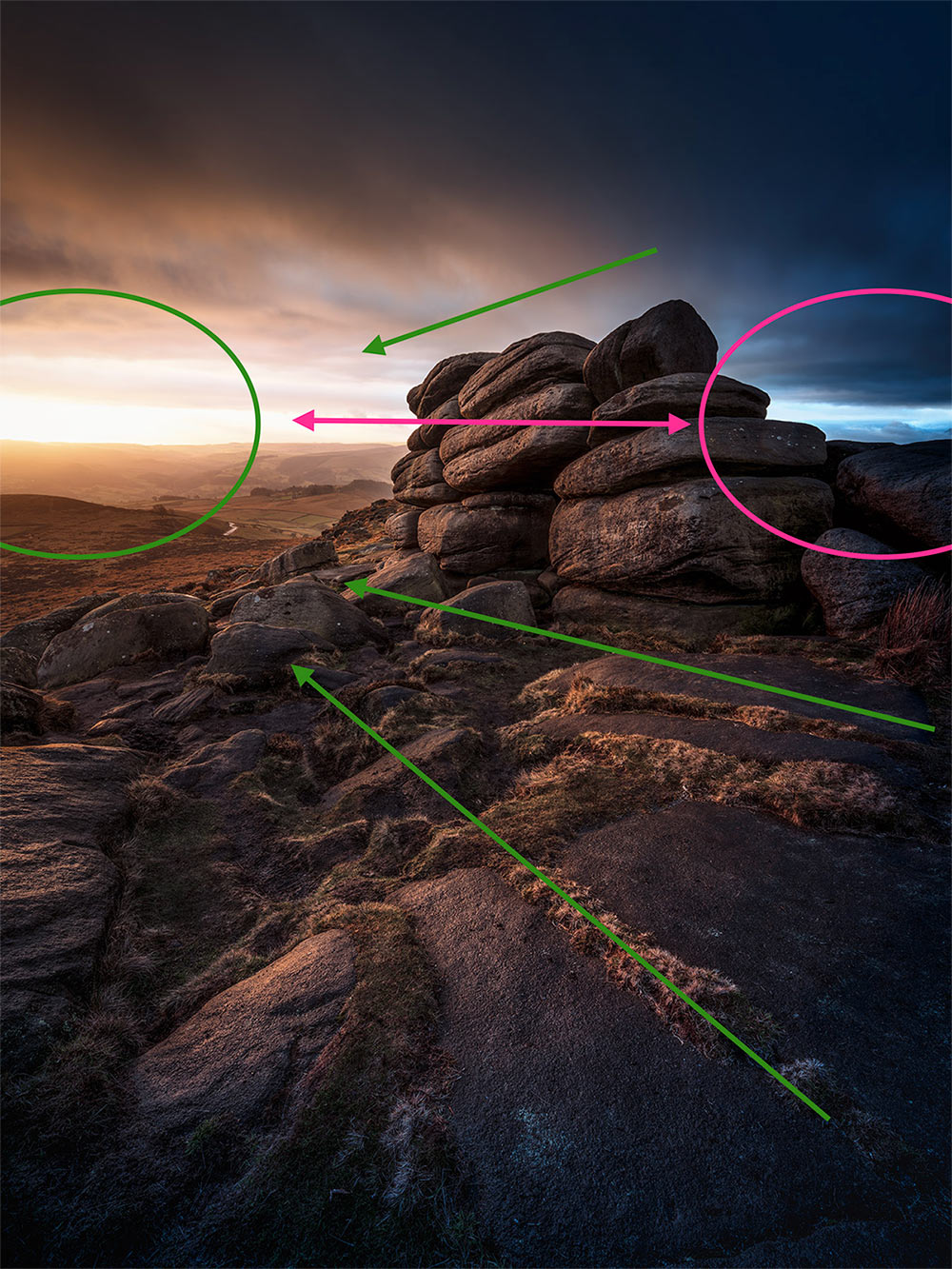
A personal favourite image from the Peak District when it all seemed to come together. A day of frequent local heavy rain and grey skies seemed to make it a non-starter but at the last moment the magic happened. As heavy cloud floated by a gap opened just at sunset approached, illuminating the rock face.
The white balance was all over the place, with gloom and bright warm light, which I capitalised on by emphasising the blues on the right and the warmth on the left.
Drag the slider to see the composition aids as I was working them out mentally while composing the shot. There was quite a lot going on and I had to work it out quickly before the light faded.
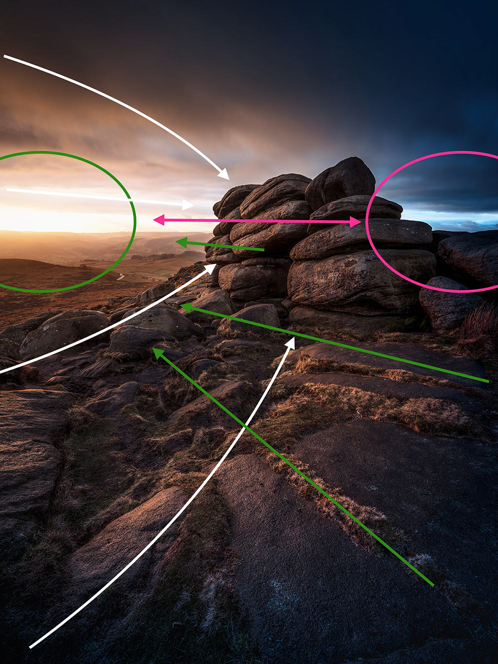
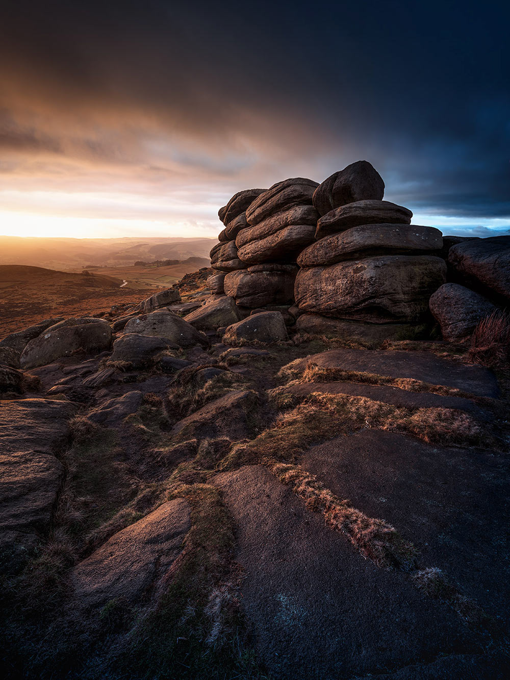
Peak District – 8-25mm @ 8mm
The base image (slide >) shows the light on the side of Shelter Rock. Lead-in lines are provided by the the clouds illuminated by the sun, and the diagonal lines of the ground, all leading in to the rock.
Shelter Rock itself has many lines, all pointing down and into the valley it is looking in to. In the valley below there are subtle details, enough to encourage discovery without detracting from the whole image. There are layers, a line of tress, and a narrow road catching the light.
Drag the slider < left for the overlay. The second point of interest is the bright light obviously. Shelter Rock is looking towards it, directing the eye in. The top of the rock angles downwards, also leading towards the light.
On the ground dried up grass grows in cracks creating lines pointing to the light. The shadows are dark, but with enough details to explore and discover.
Lastly is the light on the right, the last light of the day and turning blue as twilight approaches, it is just bright enough to draw the eye towards it, and then it returns back to the bright light.
All these elements combined make what I feel is a very powerful and moody image, and it is all because of the light.


Lake District – 7-14mm @ 7mm

Lodore Falls, Lake District – 12-100mm @ 12mm

Isle of Skye – 8-25mm @ 8mm
Two completely different scenes, one from the Lake District and the other on the Quiraing, Isle of Sky, what the both have in common is using light to draw the eye into the image. The first image of Lodore Falls shows the light does not have to be warm or golden, it is just the suggestion of brighter light at the top of a gorge which draws the eye into the scene.

Peak District – 8-25mm @ 8mm

Isle of Skye – 7-14mm @ 7mm
The Peak District and the Isle of Skye again using light to give depth to the scenes and draw the viewer’s eye into the scene. Both images have strong lead in lines that also direct attention.

Lake District – 8-25mm @ 11mm
Another image from Derwentwater, this time at twilight with the very last of the light about to fade. A stone jetty provides a strong lead-in pointing directly to the light.

Isle of Skye – 7-14mm @ 9mm
The Fairy Pools, taken during horrendous weather as Storm Ciara approached with lashing rain and winds. This was the wettest I have every been, but I would rather have this image than a golden sunset, it suits the location. Obviously the brights of the water and being central and the main compositional elements here. What helps are the tones in the image being very similar and harmonious, the central position of the peak and the lines of the mountains either side leading in to the waterfall.
CONSTRUCTING THE COMPOSITION
Constructing the composition means studying the scene and trying to work out how your eye will flow over the elements. It’s not likely you have a note pad to start sketching it out, or have an acetate Golden Spiral Overlay to stick on your screen. You should use the viewfinder, it’s far more intimate, you’ll connect with the scene better and be more aware of intruding elements or objects.
Enable the grid in the viewfinder if it helps. Look for a main point of interest where your viewer will be most engaged with lead-in lines pointing towards it. Lead-ins do not need to be physical lines, they can simply be shapes of tone or colour, objects in the landscape, clouds, reflections or anything that will guide the eye to where you want it to be. Some lead-ins are obvious, some not so much.
Secondary Points of Interest help engagement by allowing discovery, the viewer can explore the scene and discover other elements and they should be positioned in such a way to act as a lead-in to the main focal point, and to stop the eye wandering around with no place to rest. Imagine a horizon with little detail, a viewers eye could wander off subconsciously exploring it, but with nothing to discover attention is lost and the viewer leaves the frame.
In OR Out? Elements that have been cut off by the edges of a frame draw attention because the viewer subconsciously tries to complete the whole object. Similarly elements too close to edge have spaces that are awkward and too tight in comparison to the rest of the image. Give elements their own space so the composition looks purposeful and avoid clumsy spaces that draw attention.
Negative Space usually surrounds the main elements of a scene and can be used to give balance and harmony to the image. Consider the positive space and how much negative space there is and balance the two. A third or two thirds to each usually works pretty well as a rough guide, but avoid it being equal.
CONCLUSION
Now we have had a brief look at composition and you have some images on the memory card what do you do with them? Next we will look at a processing workflow, where to start and what applications you should consider.