FINAL EDITS
Final Steps to Complete the Image
The last step is where the magic happens, adding the sparkle and depth to the image. So far I kept it fairly flat, not wanting to over brighten or darken tones I may want to retain. Now I will take the final image and review it.
REVIEW THE IMAGE
Take your time to review the image and remember how much your screen background influences it. A back illuminated screen really does alter your perception. It is usually best to work on a darker PS Workspace background to reduce the glare, but then consider the final image in print is nearly always going to have a white mount around it.
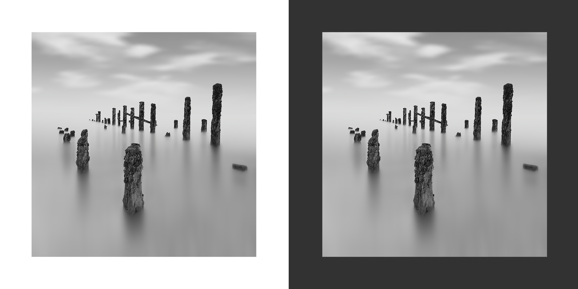
The same image viewed on white and dark background
Consider how different these two look. It is the same image viewed on different backgrounds. The dark is my PS background colour. I consider the light greys too light on a dark background but on white they look fine. The centre looks fine on dark, but on white it looks a little too grey and muddy and my immediate reaction is it should be brighter. The posts at the back are too dark but I know that already. It is interesting to see how they compare.
→ TIP Right click on the PS Workspace away from the image and change the background colour. If you don’t have white just select Custom and set it. This is a really fast way of swapping and making judgements on the fly.
The edits I know I want are to brighten the centre a little, add more contrast to the water and lighten the rear posts with more contrast into the foreground posts. I will also darken the sky and perhaps the foreground with Grads I can adjust.
MAKING ADJUSTMENTS
Most of the adjustments I will make on the fly, making global adjustments and then undoing it and paint back with the History Brush. It allows a great deal of freedom. In some parts I will use the selections for more accuracy. I’ve stamped the layers in one new copy Shift+Option+Cmd+E (Windows Shift+Alt+Ctrl+E.
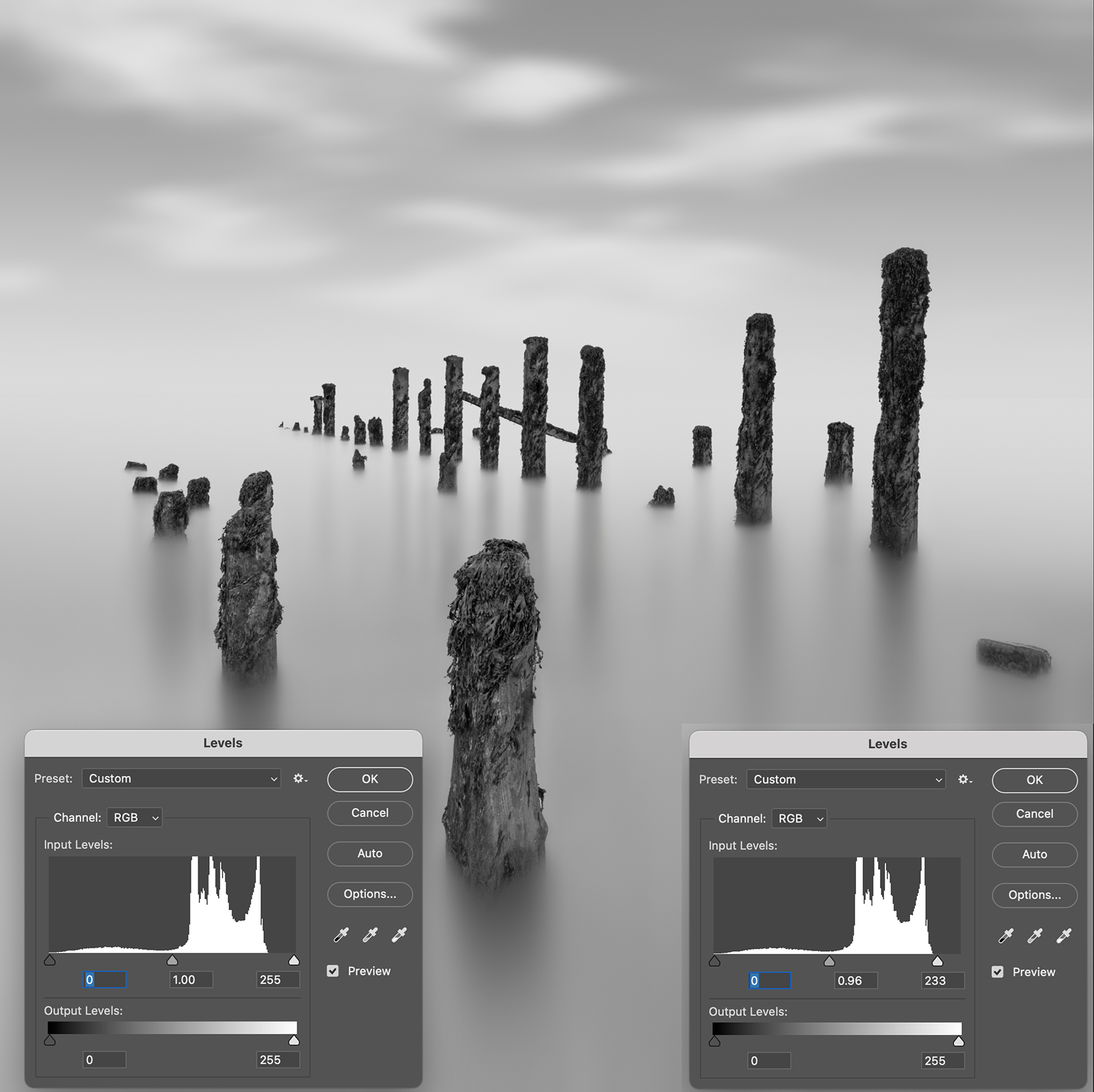
Using Levels on the image
RUN LEVELS
The first edit is Levels Image>Adjustments>Levels. In the dialogue box it shows the bright are quite a way from the right, meaning brights are not white.
I drag the slider to the histogram point making them white. It will be too bright but that’s fine.
Undo it in History, click the box at the step we just undid and then select the History Brush. Now with the History brush I can adjust size and opacity and paint back in the areas I want brighter, paying attention to on the horizon and also brushing downwards to extend highlights between the reflected shadows of the posts. Doing it step by step gives so much control.
I could use a Levels Adjustment Layer. Add one, set the white point, then add a black mask to it to hide it. Then use a paint brush with white to paint on the mask to reveal the adjustments. Doing this means you can go back to it and repaint at any time. I prefer the flexibility of History Brushes.
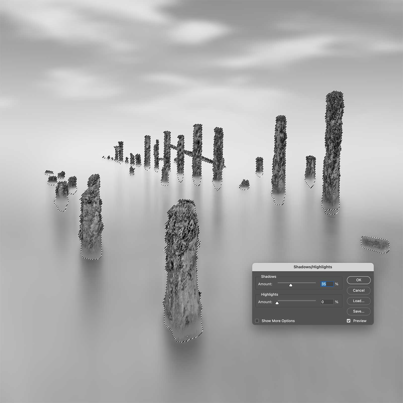
Lightening the posts with Shadows/Highlights
SHADOWS & HIGHLIGHTS
I want to alter the background posts and remove the darkness. In Image>Adjustments I’ll run Shadows and Highlights after I’ve loaded the posts selection to preserve the background.
Then I’ll undo it and paint it back with the Histogram Brush, mostly ignoring the front posts, I just lift them a very small amount on the front face. I am careful not to alter the bases of the posts too much or they will not blend in. Remember it is all about blending, not swiping with a brush.
Use Levels again to add in a little more contrast to the front posts, working as necessary until they really start to pop. You could also use Curves, or Contrast, but they do a similar thing.
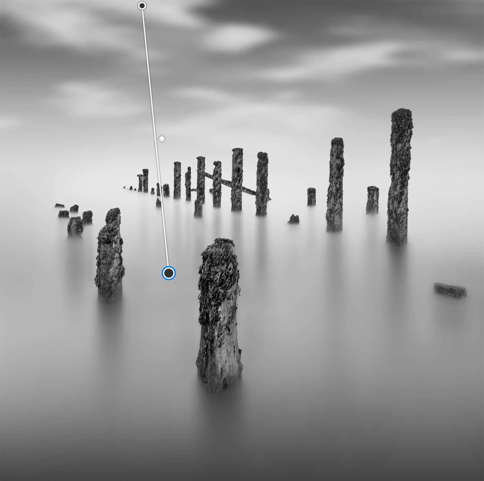
Adding Gradient Adjustment Layers
ADD GRADIENTS TO THE FOREGROUND AND SKY
I want to add some depth to the top and bottom using Gradient Adjustment Layers. I’ve already added one on the bottom. Add the Grad Layer as a Linear Grad with solid to transparent, and then drag the path line where you want, adjusting settings to suit. Make sure the Foreground colour is black.
Sometimes adding a grad like this does darken, but the contrast is lost because it is just a grey layer. At the top of the layers panel next to Opacity is a Blending Mode. Changing the mode has many effects, depending on the setting.
Change it to Overlay and the contrast returns. You can then adjust more, or just reduce the intensity with the Opacity.
Notice the top of the posts have been affected? After doing all that adjusting to the posts the grad is darkening them again. A white mask was added with the Adjustment Layer, I want to add a selection before the mask, so just right click and delete it. Load your selection for the posts and then add a mask to the Graduated Layer. The selection will remove the posts from the mask and delete the effects of the graduation.

Quick Mask editing and Levels shown together
ADD MORE CONTRAST
It is looking flat still, and I decided it really needs more depth, especially with the shadow reflections in the water, they are not dark enough and it needs to be lighter between them. Making adjustments means constantly reviewing and making more from time to time. I could use levels, contrast, the History Brush, or even use other tools such as Dodge and Burn. The issue with freehand tools here is keeping brush strokes straight.
Instead I will use a selection again. I want the reflections darker, and the posts darker at the bottom too. I’ll load the ‘background less posts’ selection and do a quick change to it. Clicking Quick Mask I can remove parts of the posts, and I am quite aggressive with it too because I want enough space to feather blend the darker and lighter tones back together.
Exit Quick Mask and the selection is shown with the changes. I then use levels and make quite an aggressive change, moving blacks up, mid tones up and whites up.
The screenshot shows the Quick Mask and Levels steps combined for reference.
Next I can remove the selection Cmd+D (Windows+D). There will be an edge on the posts, and the sky is now too bright. In History I can just go to the step before the Levels adjustment and click the check box to active History Brush, then select the History Brush tool and remove the changes, bringing the sky back down and blending the changes on the posts together. The History Brush can be used to redo changes (paint back) and undo changes (paint away).
Re-Blur the Sky
I CHANGED MY MIND ON THE SKY
As so often happens I decided the sky needed a little more work, I wanted it softer with more motion blur. It was easy to do though.
First I duplicated the layer and then went back to Path Blur. Two passes in two directions was all I needed, altering the amount to suit.
I didn’t bother with any masks or selections, there was no need. Instead I just undid it and painted it back with the History Brush, avoiding the posts. If you find the need to do the same but it will impact another area just load a selection and invert it if necessary.
ADDING DEPTH
Finally, I add some depth by fading out the background posts a little. For an image like this it is so easy because there is very little detail in the background around the posts. All I did was select a grey tone near the posts with the Eye Dropper and with a very low opacity soft brush large enough to cover the area, paint over the posts. It doesn’t need a great deal, just be delicate and don’t overdo it.
An image with detail or a colour image would be better by using levels and moving the black point, or switching to the Camera Raw filter and using Negative Dehaze.
BANDING
A problem you may see is Banding, or visible bands in areas that should have a gentle graduation in tone. It is caused in a number of ways, usually from using an 8 bit image which doesn’t have enough information in it, or by pushing the processing or editing too far, beyond what information the image has. For black and white images like these the last thing we want is banding.
There are a few ways to try and reduce it, one is to add a slight amount of noise and thereby hide the banding, another is to switch the image to 16 bit (Image>Mode>), run Surface Blur, and then switch it back to 8 bit. If it was 16 bit try using Surface Blur. Another way is using Motion Blur.
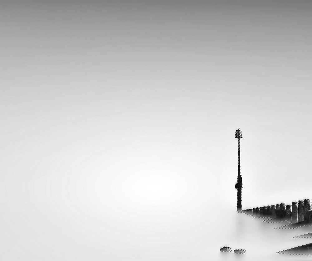
Banding in the sky in this image
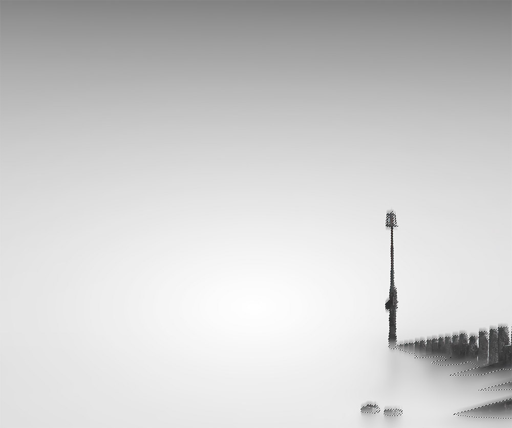
Banding removed with Motion Blur
I didn’t have any banding in my image so I used a different one. All I had to do was run Motion Blur, just enough to remove the banding. I can then enable the History Brush in the History Panel and with the History Brush paint to remove the blur on area I do not want affecting. Additionally, use a selection if it helps, or just do it free hand.
FINAL IMAGE
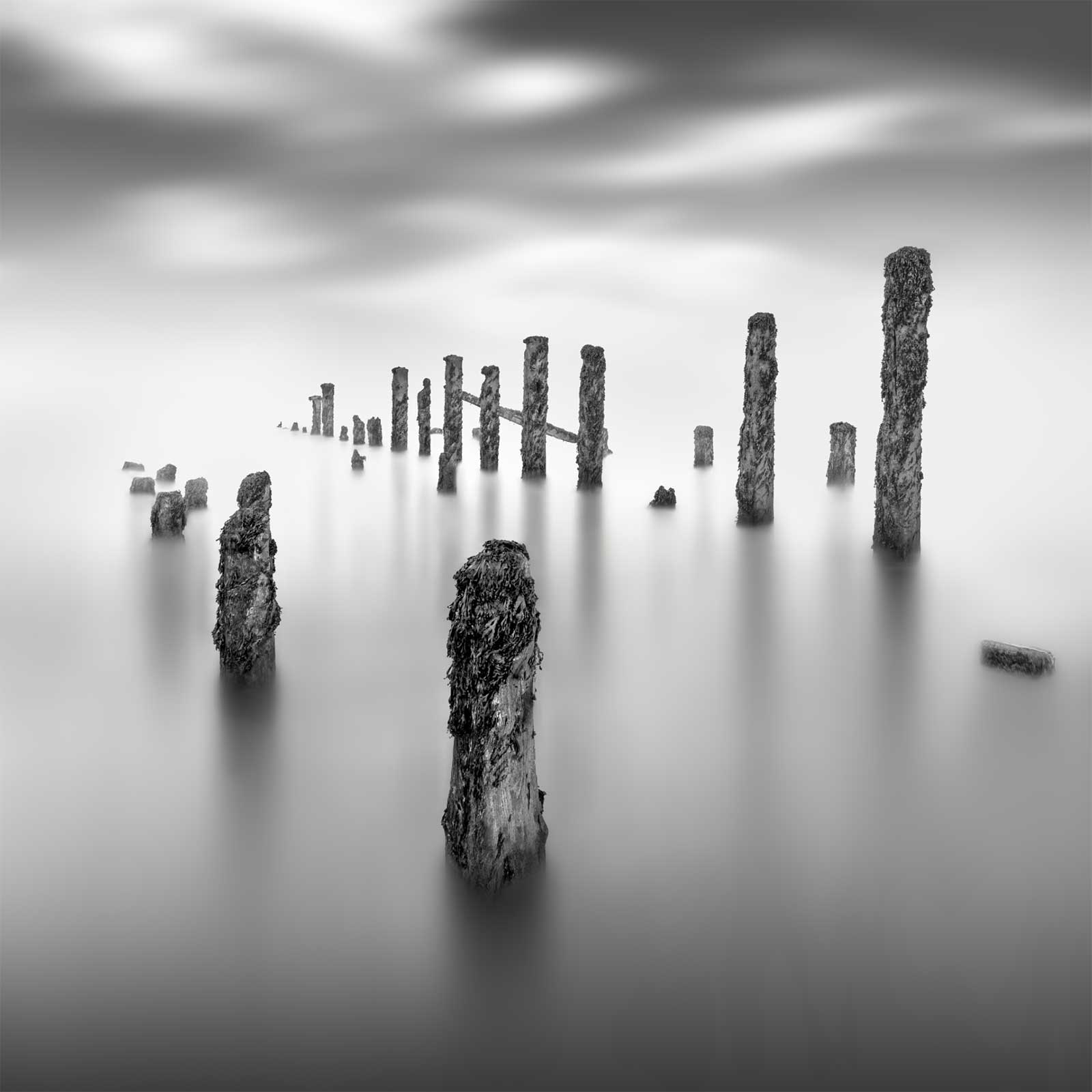
The image editing is complete. Go over your image and check for any details missed, any edges that need to have errors cloned away or spots that need removing. Check if there is any noise that needs to be removed or if it needs sharpening. I prefer to do this in Topaz Denoise, however just use PS if you don’t have anything else. Compare it to the start image and just how much it has been changed. The start image was not suited to a minimal long exposure image; I used it on purpose to demonstrate all the techniques you may come across. See the section Examples for a few more images and brief explanations.
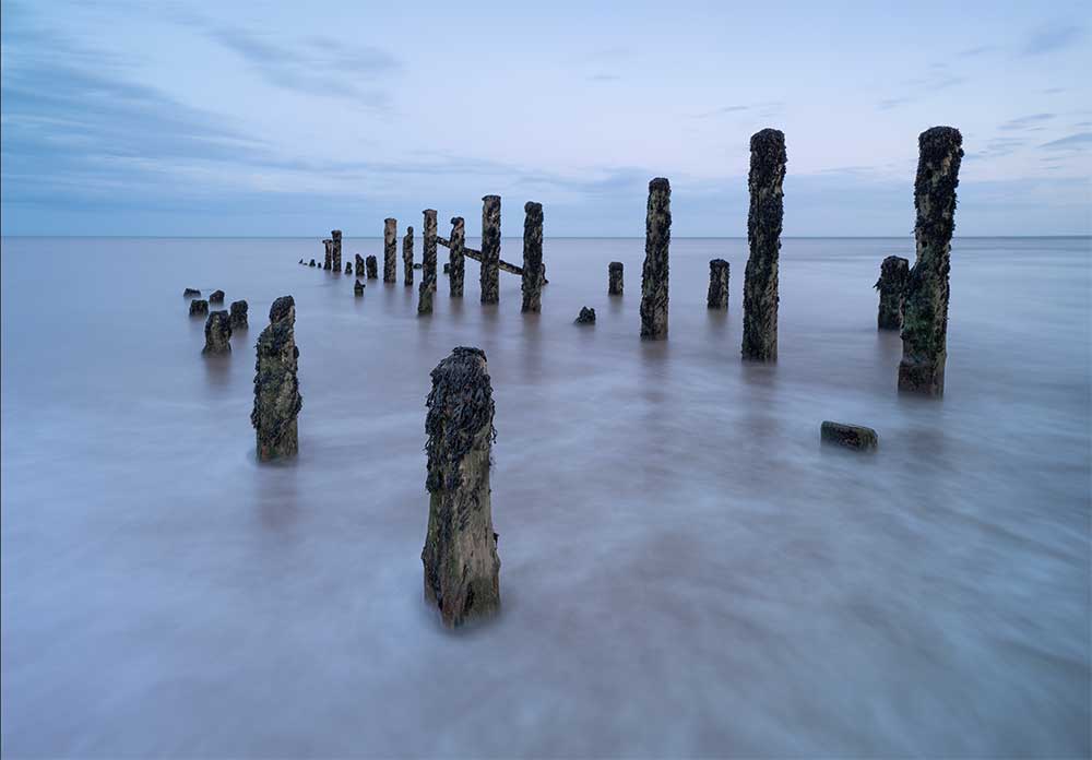
Start Image. Compare how much it has changed.

Final Image
One final tip. You have probably worked on your image for quite some time and the old saying ‘familiarity breeds contempt’ does apply. You may hate it or be thrilled.
STEP AWAY. Leave it now for a few days, do something else, come back and review it again with fresh eyes and objectivity. Review it on white and grey backgrounds and see if you’re happy with it, or make a few changes. I really believe in getting some distance before deciding. A painting is never finished they say. But it is also good to know when to stop.
Make sure you save your file as a Photoshop PSD with layers so you can come back to it and review, and remind yourself in future what you did. File sizes can be huge and after a while you won’t need to save layers, just flatten the whole thing. I save as a Tiff and then save smaller Jpeg’s for use online.
COMPLETE
This section is complete. In fact the whole editing is complete. You may feel it has been a marathon depending on your experience. Hopefully you have a good understanding of some of the tasks and techniques needed to edit an image in this style. It will be a lot easier if your start image is a more suitable image.
The next section looks at how to make your images look like Fine Art images with borders around them.
Go to next section.
